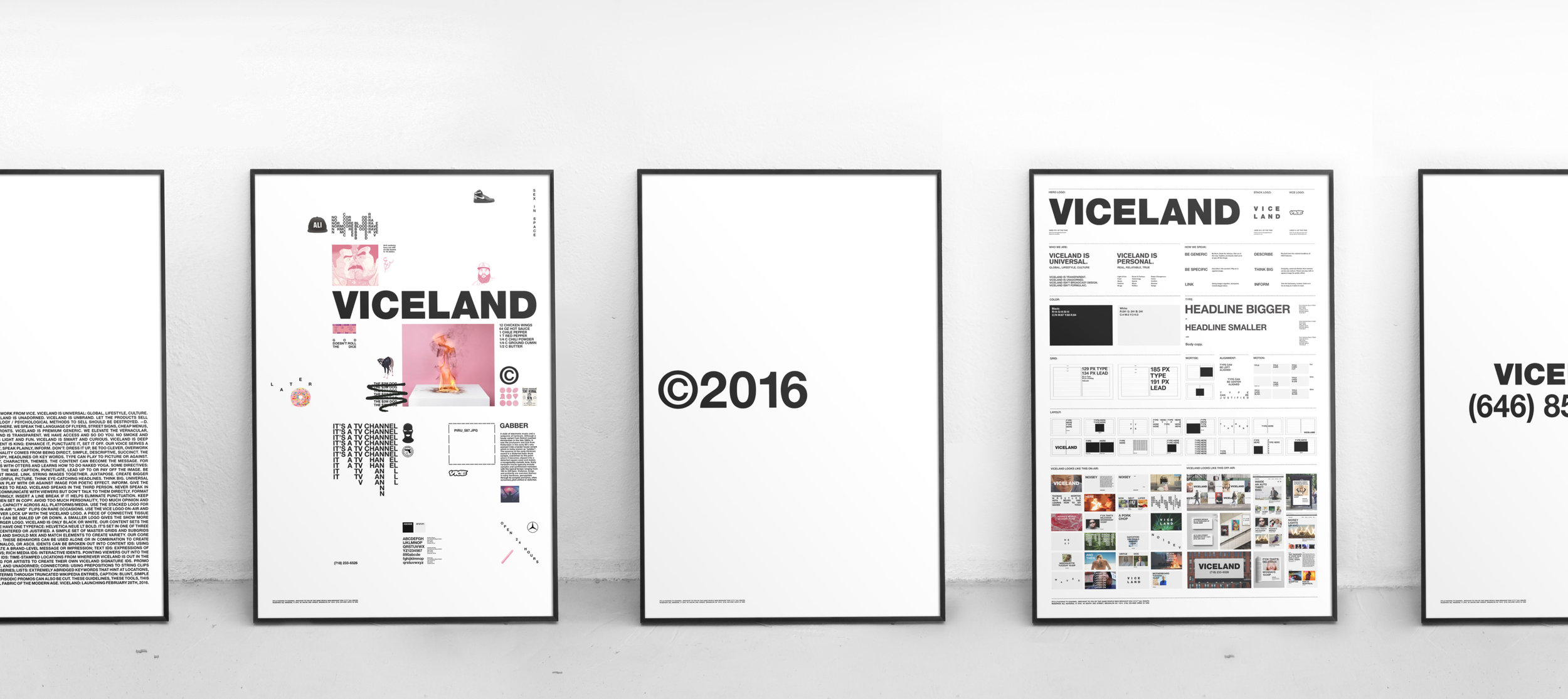
TV For Your Vices, Gretel's new identity for the media brand brings it squarely into the future
As VICE Media expands, it ventures further toward the cutural and edgy reporting style that made it famous, Gretel NYC has taken this attitude and made it shine.
Vice media, seemingly founded longer ago than you would think (1994) has made a name for itself by being a rebellious, bold (funny at times) and brash media company.

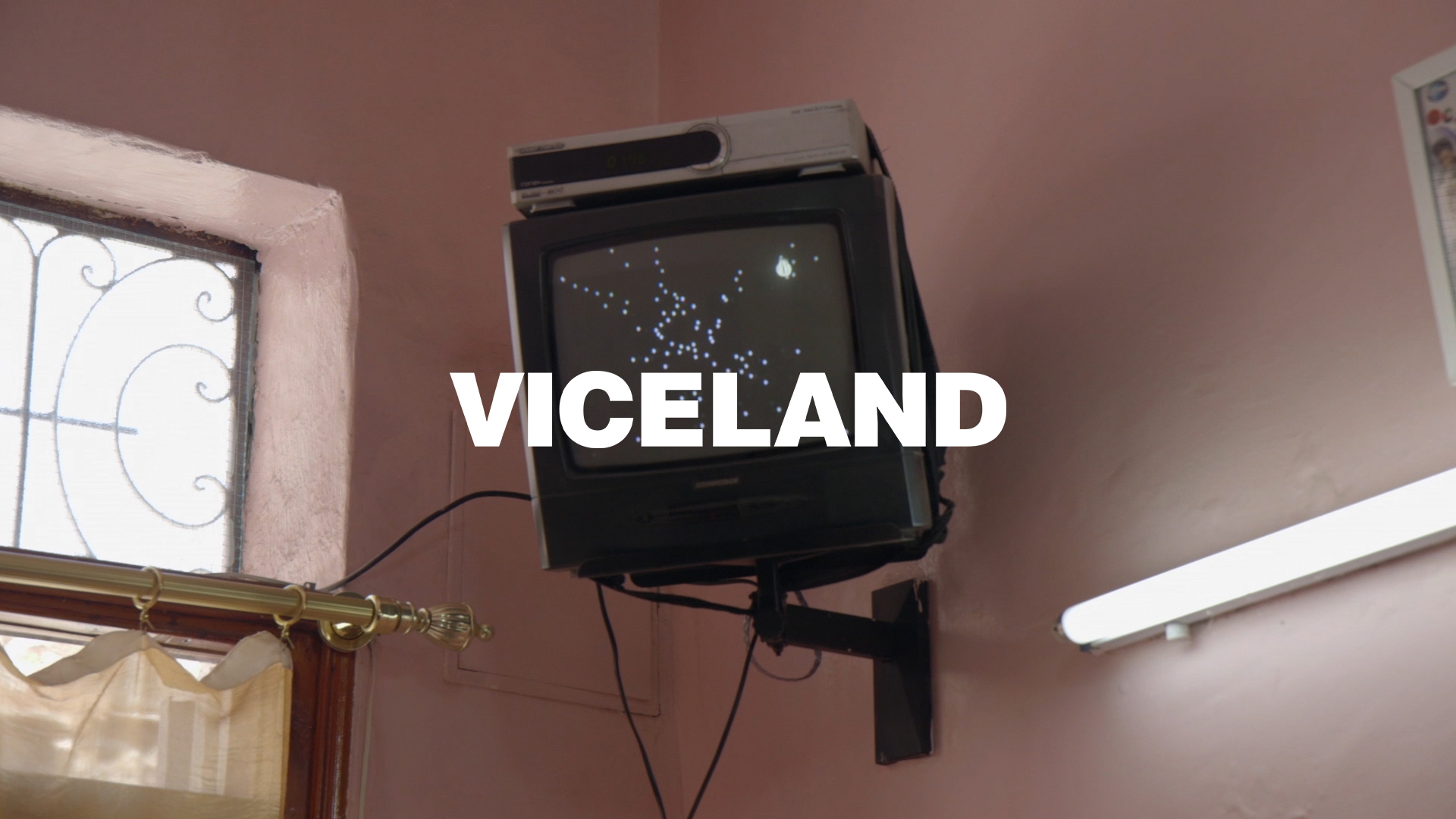
Its style epitomizes modern journalism with a voice that is skewed to the Gen Y and millennial generation, it's blunt, it's raw, it's real. Vice has capitalized on this unique media perspective and is expanding its reach with the launch of "VICELAND". A tv channel presenting global lifestyle and culture that doubles down on their younger audience. With shows like "F*ck that's delicious", "Gaycation" and "Weediquette", VICELAND" showcases daring content fashioned for the internet.

D&AD award-winning creative agency Gretel based in New York City was tasked with branding the new VICELAND channel. Gretel is no novice to news media projects, with the likes of National Geographic and the New York Times "Daily" under its belt. Vice media, however, is a much younger and bolder brand and the VICELAND channel tops even that identity by diving deeper into covering culture with an added sprinkle of news and politics. Content for the channel falls into self-defined categories of 'smart and curious', 'light and fun', or 'deep and dangerous' and production has been described by Creative Director Spike Jonze as "less of a TV channel and more of a laboratory". VICELAND's content is rich and experimental and Gretel says it was briefed to create "an identity that could express the tone and personality of each of VICELAND’s shows without overshadowing the content." Gretel responded to this brief with a pared-back and minimalistic typographic execution, providing balance to VICELAND's brand, structure to disorder.

The clean black and white designs almost have an 'anti-brand' feel to them with no fuss type layouts and the use of one font, in one weight. In typography different typefaces and weights are often used to create visual interest and hierarchy, however, the VICELAND brand has accomplished this with the nominal use of just Helvetica Bold. Helvetica is timeless, simple, purposeful and devoid of frills and the programs and creative layouts utilize white space heavily building upon the minimalistic aesthetic. The visuals have tones of European Swiss Type style with their focus on simple typography and limited use of just black and white. This minimalism is then punctuated with the attitude of the VICELAND brand. Title cards of weed and music concerts are overlaid with a giant "VICELAND" and blunt, raw copy content graces the spacious white layouts. Grid systems have been used and adhered to heavily in many of the layouts, a modular system that can adapt seamlessly through the wide array of VICELAND's programming themes. The look is very structured and orderly and the use of all caps only adds to the square, grid-like framework.

This minimal style is also reflected in the animation style of the brand. The animations are void of bells and whistles with simple blinks, reveals and analog-style movements. This has been utilized in creative ways in which words blink on in crossword-style overlaps, creating a unique sense of repetition. A great execution (see figure A) is the ad for one of the channel's programs "Noisey", where the name and a small description reveals itself upward, continuing with letters blinking off to highlight the run time "Weekly 10:00 pm".

I've been an avid viewer of Vice News in particular for a few years now and recently picked up a few hours of watching VICELAND to write this article. VICELAND is a pretty fascinating collection of shows and news, it's hard to compare it to any other media company out there in terms of its scope and authenticity. From eating shows with rappers to serious journalistic pieces on the rise of terrorism, there's a dichotomy of different content available. In particular "Weediquette" caught my attention, watching presenter Krishna Andavolu get baked out of his mind whilst also covering the serious topics of weed cancer treatment provided the most exclusively unique tv viewing I've seen in a while.
Gretel's typographically focused solution provides a balance to VICELAND's chaos, a structured, modular system with a timeless font to accompany what some have referenced as the new MTV. If VICELAND is the new MTV it's certainly been updated for the millennial audiences, with worldly pieces on the global state of affairs and a focus on rich digital content. Gretel has provided a walking frame enabling this content to run. Its orderly grid-like design execution helps to frame pieces of content no matter the substance, in a way that lets it shine without ever overshadowing. It's a symbiosis of simplicity and attitude that looks to break typical news and media conventions.

Hey, enjoyed this article? Interested in learning more about how technology advancements like the M1 chip will affect designers in the future? Sign up to the newsletter for more.