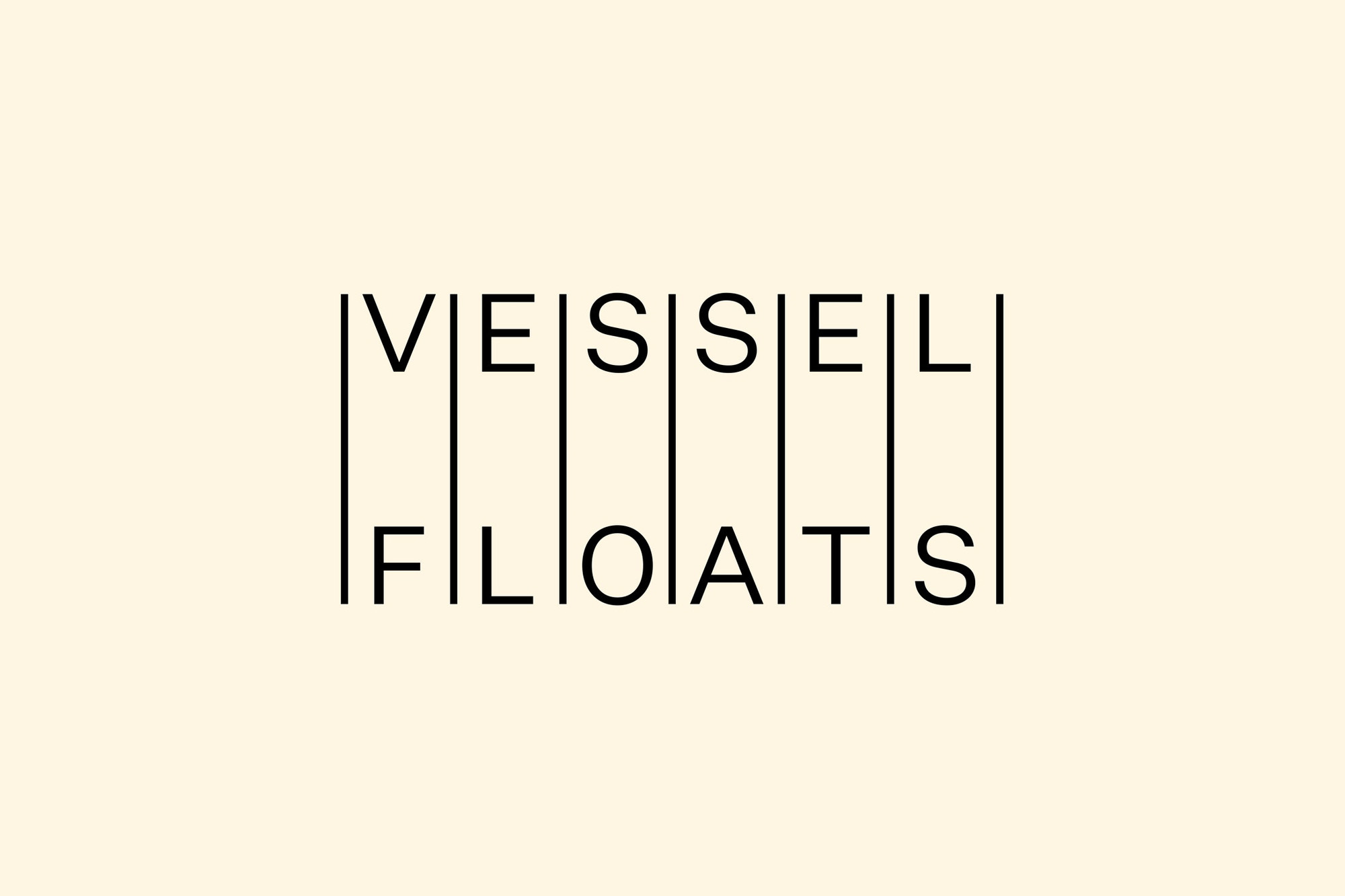
Vessel Floats
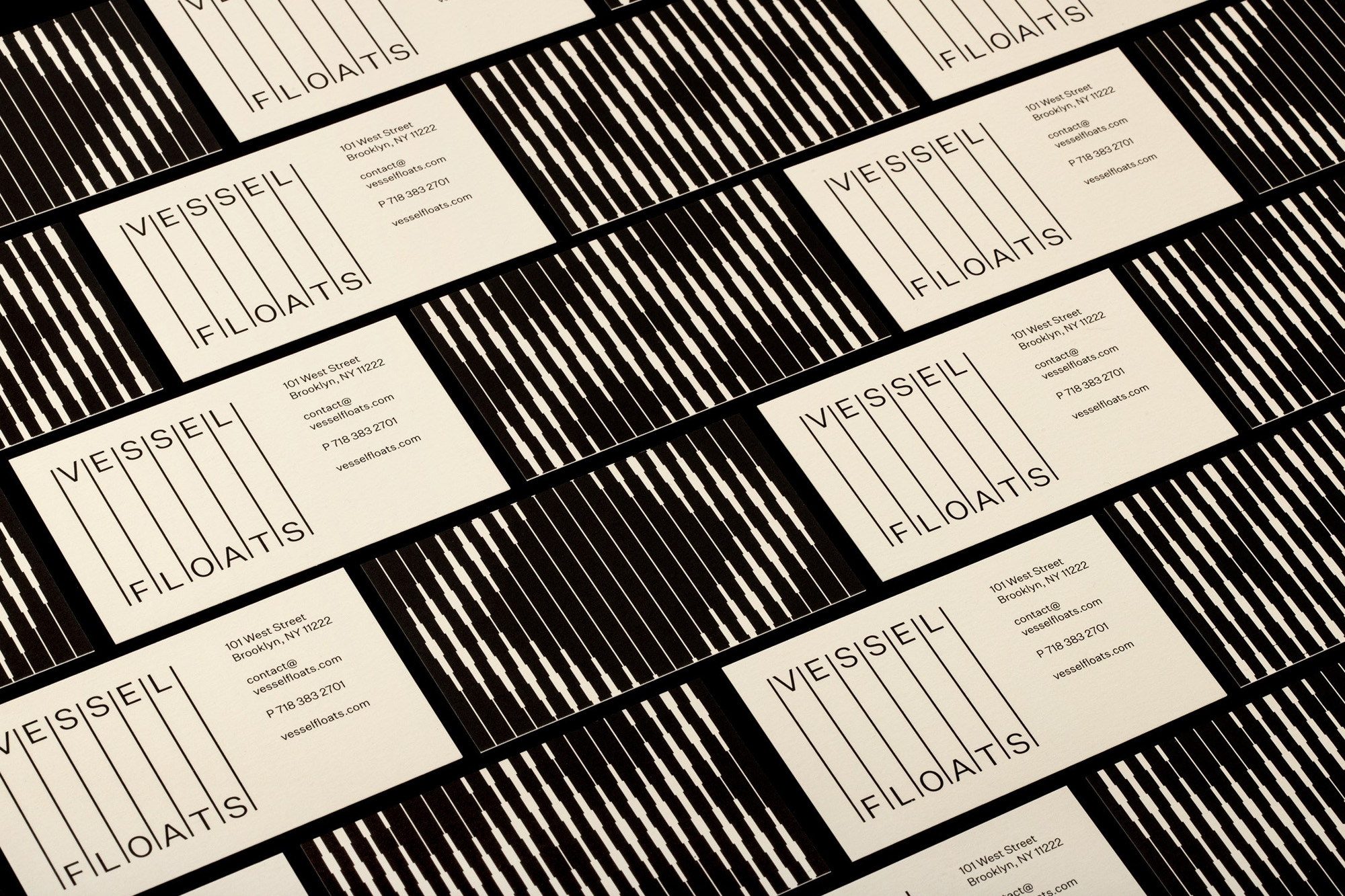
Order Studio creates a brand identity for Vessel Floats
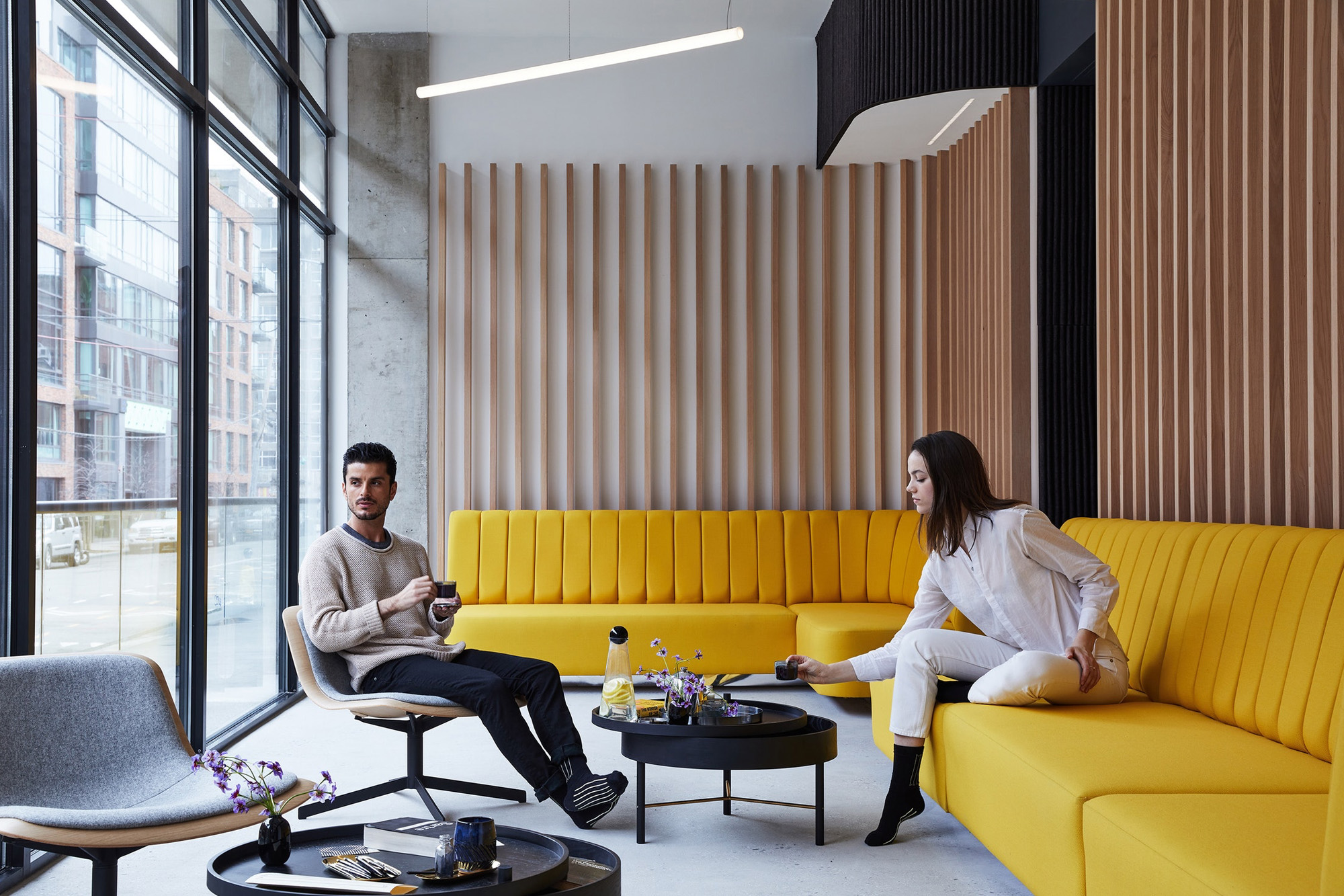
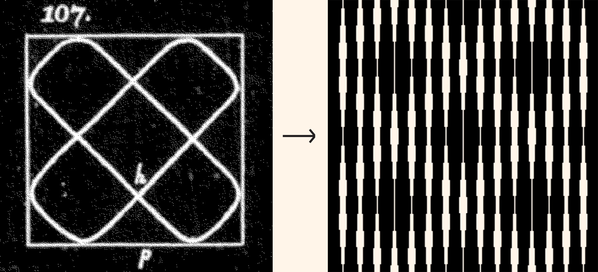
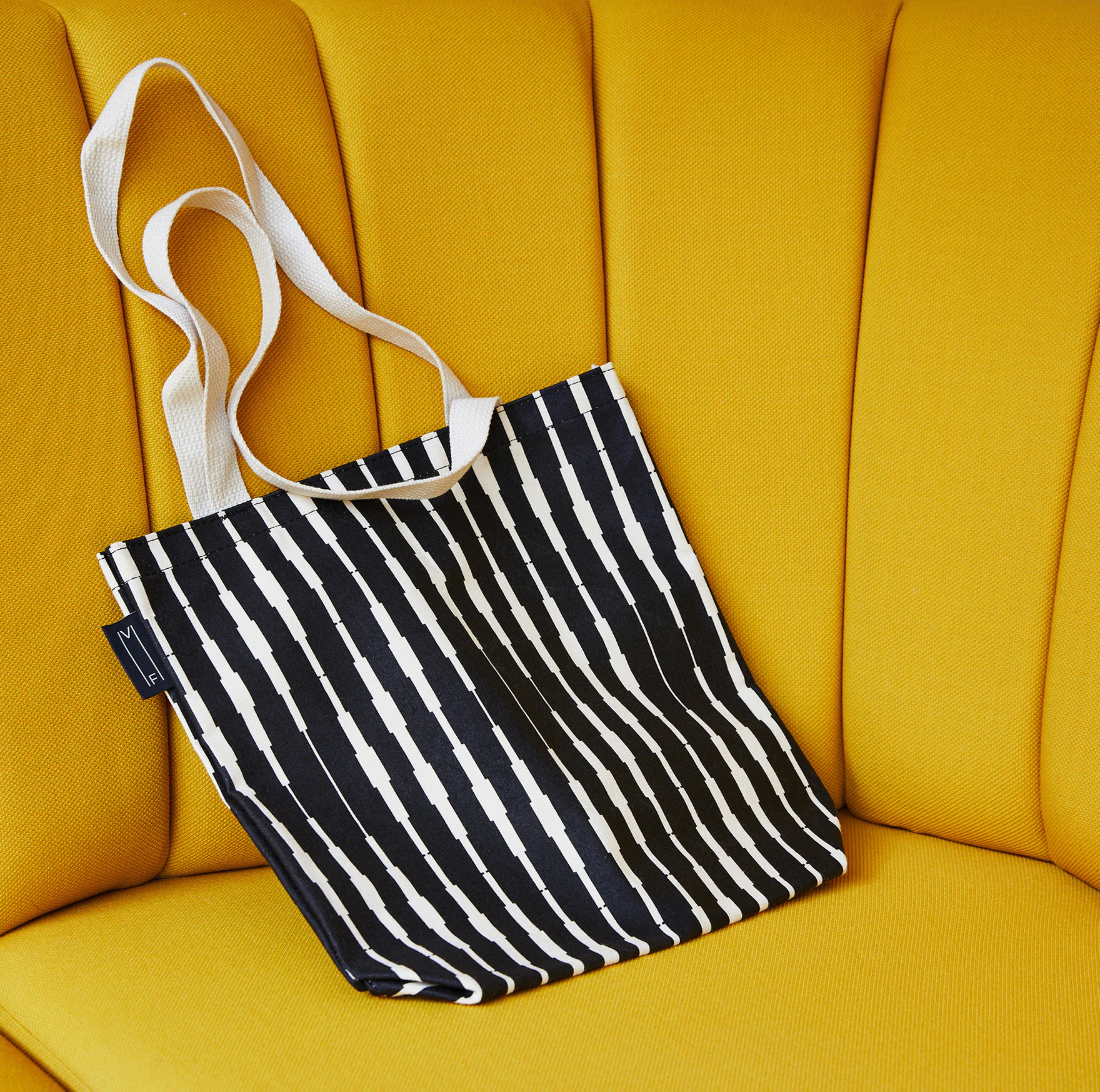
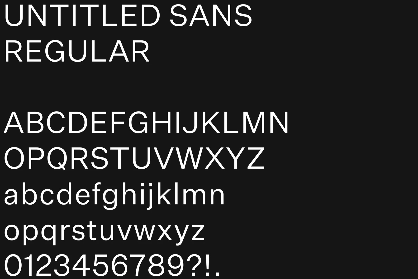
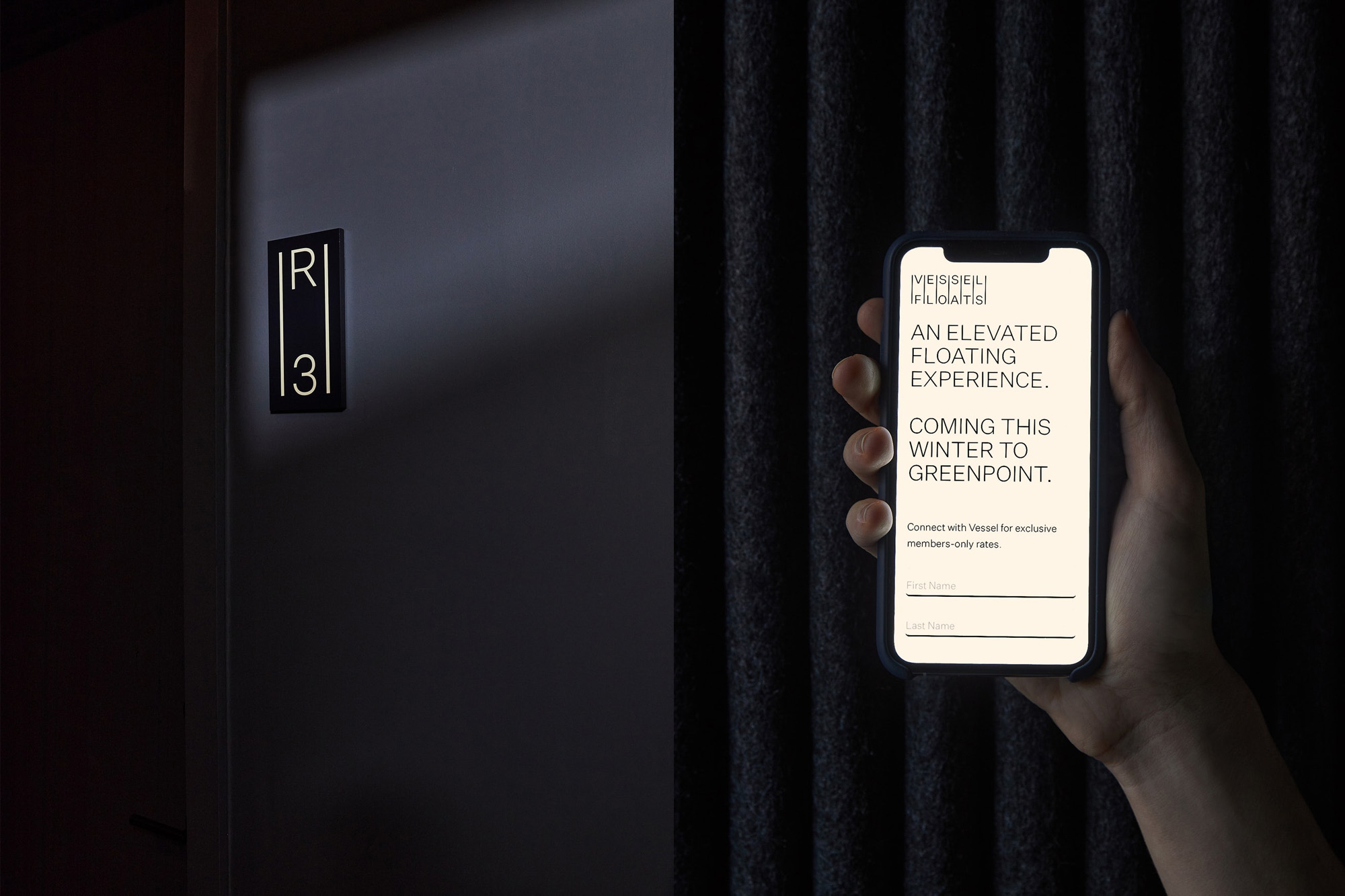
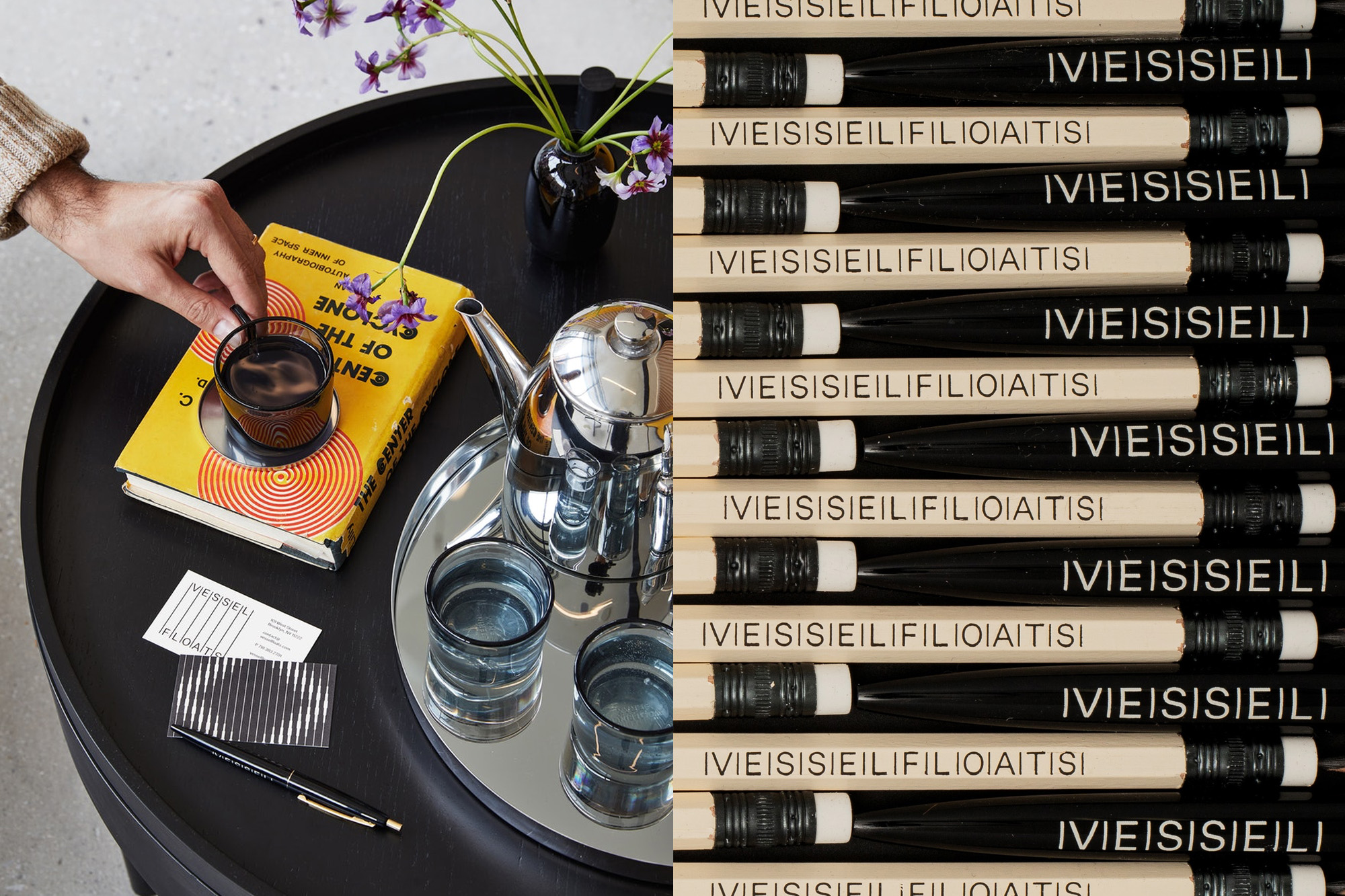
This branding work is for a sensory deprivation and float therapy spa...
If you haven't heard of either of those things I don't blame you, they can't exactly be categorized as 'floating' 😉 around in the popular zeitgeist. Essentially, the tanks are like an isolation chamber with water. The user floats inside them and the tank is completely soundproof, with the goal being to completely block out external stimulation, which helps promote mental relaxation and clarity. It's almost like they should call them meditation chambers.
Figure 1

Order Design Studio created the identity for Vessel Floats which has a more 'mindfulness-oriented' approach to the sensory deprivation experience. Order is run by business partners Hamish Smyth and Jesse Reed, who both have backgrounds at Pentagram working under the celebrated designer Michael Beirut (yep, I know, I wish I had that resume too). Design legend mentorship aside, as a studio Order has worked on well-known brands like MOMA, Kickstarter and the Hilary Clinton campaign. They also started Standards Manual, an archive of Graphic Design History and artifacts (The NASA manual is on my Christmas list).

Figure 2.

A sense of pattern and structure is what originally struck me with this work, the minimal and overall square shape of the logo feels 'ordered' (pun intended) with an organised structure that's pleasing to the eye. The logo was inspired by the interior architecture of the Vessel Floats property, which features thin wooden slats and beams running upwards along the walls as a distinct Interior Design detail. (Figure 1)
The identity gets increasingly more interesting when analyzing the lined pattern designs that are present on collateral pieces. The graphics feature the same vertical lines as the logo but with differing widths in sections used to create subtle shape and form. This style is not arbitrary and loops back to Order's research focused process. Seeking to connect the concept of water ripples to the brand, they discovered the vibration illustrations of German scientist Ernst Chladni. They then used visual cues from his work to create the Vessel patterns using the thickness in lines to mimic the Illustrations (Figure 2.) Abstract yes, but incredibly creative and intuitive as well, fusing meaning and purpose into the brand patterns.

The chosen typeface for the project is incredibly reductive and simple, aptly named 'Untitled Sans' (Oooo very hip). The type execution has been restricted to just one weight of Untitled Sans, and visual interest has been deftly applied using size variations and all caps. This minimal approach is continued with the menu and website design, with airy layouts backed by a lightish cream background. The logo can be seen on these backgrounds with varying lengths. Order has crafted the logo to be versatile, the lines change length depending on the output, they're longer on the menu, but much shorter on the website and kind of in the middle of those sizes on the business cards. This allows the logo to fit seamlessly to different formats and double as a more of a graphic as well as the brand's identifier.

Order's design work for this project appears to be led by its research. Whether from the vertical lines that were informed from visiting the Vessel Floats property. To the abstract patterns birthed from scientific vibration diagrams. This mix of abstraction with purpose is not an easy marriage to pull off and makes the creative all the more engaging. I've been pleasantly surprised to learn about Order's background with Pentagram and involvement with Standards Manual, and can't wait to see what wacky health therapy project they help brand next! (I'm kind of super interested to try these Float Tanks now, anyone else? 🤔).

Hey, enjoyed this article? Sign up to the newsletter for more.