Wolff Olins: Uber Rebrand
Back to Black
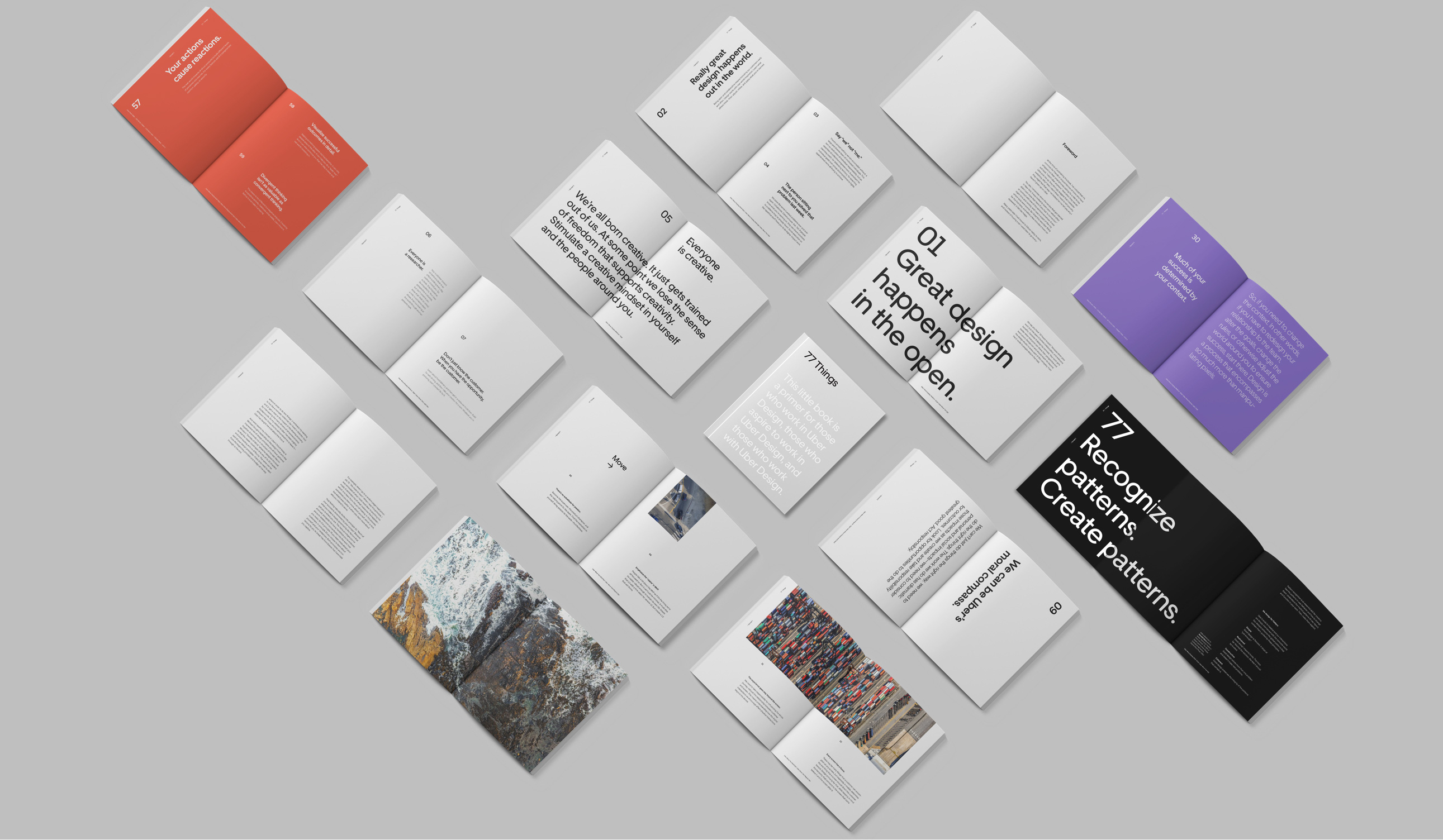
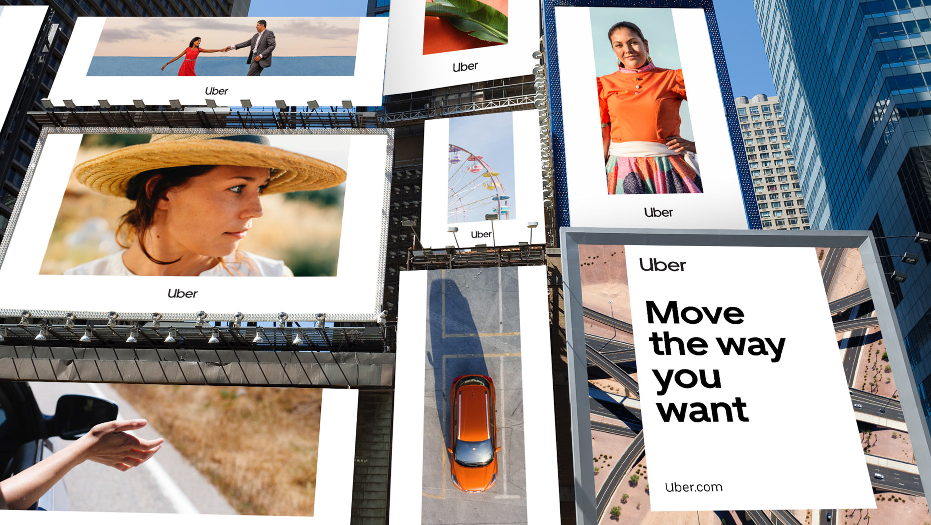
Few companies can boast a total upheaval like Uber, the ride-sharing app is credited as a major instigator of the new "sharing economy" and has revolutionised the taxi industry.
Now many years later, Uber is more than a young start-up and technical innovator, it is the market leader. As the leader, Uber is square in the crosshairs of the competition with viable alternatives like Lyft, Juno and Via. In this different landscape, Uber needs to ensure its brand can weather the storm and remain on top. Uber's brand and name recognition are extremely strong, but its visual aesthetic has suffered inconsistency over the years, with multiple changes and logo redesigns. Fast-forward to 2018 and Uber was starting to mature, transitioning from a car ride-sharing app to a "global mobility platform”. They collaborated with creative agency Wolff Olins, MCKL Type Foundry and their own internal design team to machine a new rebrand.

Uber's inclusion of both their in-house team, an outside creative agency and a Type Foundry is a clever triad of perspectives and skills to bring to the table. The combination of brand purists from within, fresh ideas from new creatives and an investment in typography has produced an Uber facade that finally feels appropriate. This new revival for Uber screams sleek black sedan and was developed with no absence of insight and strategy. As outlined in their case study, Uber sought to refine and redefine its values and goals whilst endeavouring to clean-up the visual confusion of the old 'Circuit' logo. (figure 1). Uber had contemplated relevant feedback that helped drive the direction for the rebrand with three main revelations. 1. customers associated the color black with the brand at a rate of 88%, 2. people had wondered where the 'U' went, which coincided with 3. the fact that the name 'Uber' had significant market penetration and name recognition. These insights have been incorporated in the new logo in the most obvious of ways. A simple wordmark on black(1), that brings back the 'U'(2) and states the brand name (3).

Figure 1

Uber! the wordmark is now clear, clean and coherent, free of the frivolous lines and seemingly arbitrary circuit and bit symbols of the old logo. The new-look opts for the straight-forward, understanding that the most recognizable logos in the world are incredibly simple. This is then supported with a robust set of design language tools that make sense and spread coherence. The color system favors black on white with a small supporting cast of secondary colors that are used sporadically to highlight key interactions. A key side-character, in particular, is the 'Safety' blue color which appears for touchpoints of support and assurance like the "ride check" feature. This design highlights a robust acumen of color theory, of blue's association with calm, stability and comfort.Uber has devoted a lot of time and money into design with this rebrand, nowhere is this more evident than their investment in creating their own brand typeface. Dubbed 'Uber Move' this choice of creating instead of purchasing, is a leap to differentiate themselves and have a unique building block of the brand for years to come. The typeface is round and flowy with perfectly circular letter bowls on g's and b's and shorter cut-off terminals on the ends of the letter e's and r's. (figure 2) MCKL who primarily worked on the technical aspects of the typeface describes its style as "early twentieth century sans serifs..." "...reimagined through the lens of transportation fonts from around the world." Other creative bricks of the brand include the advertising collateral, bringing back the 'U' is cleverly continued with the U-frame, a placement of images and video that creates the letter U in white space (figure 3). It's these and other smaller design decisions that are thoughtfully considered and help to create a memorable and cohesive feel throughout all of the design touchpoints.

Figure 2.
Figure 3.

Uber's new rebrand finally feels as seasoned as it's many years of operation, it has outgrown its Silicon Valley start-up persona as it's matured and expanded its operations. The brand has undergone years of reiterations and auto detailing but the latest speed polish has left the chassis shiny and pertinent. Design elements have been completely reconsidered, feeling more stable and justified with the eviction of arbitrary or carelessly placed elements. All decisions feel purposeful and calculated favouring simplicity of form and clarity. Post rebrand, Wolff Olins' claims that Uber's brand value has increased by as much as %51 and pre IPO (2019) the company was valued at $82 Billion. In the time since Uber's IPO has run into trouble. but, their rebrand still feels like a good investment as they look to better the customer experience and attract more investors to their new vision as a global mobility platform. If next time you book an Uber your expecting a shiny sleek black sedan to turn around the corner and whisk you away safely, the rebrand may have already done its job.

You can view the full project by Wolff Olins here