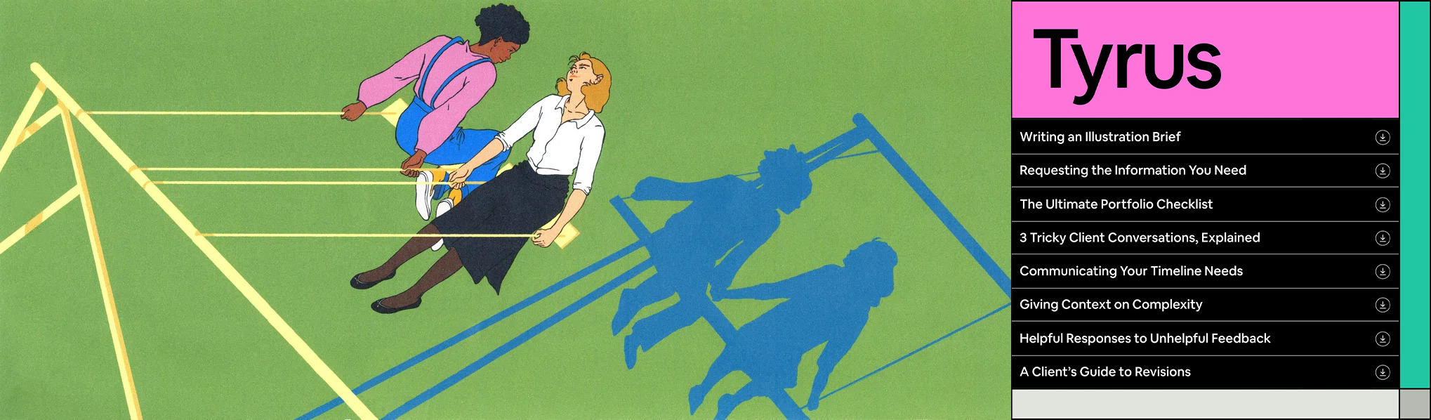
The Tyrus Toolkit
With works from self-identifying female Illustrators, Tyrus is an online toolkit demystifying project management for freelancers.
Tyrus is a free digital toolkit for freelance Illustrators devised to help them ace their projects and smooth out the bumps in the road in their process – developed by Airbnb.
Puzzled? What does Airbnb, a home rentals company have to do with design? It's akin to buying vegetables from Goldman Sachs or booking flights from a florist, the two seem unrelated...

On the contrary though, head of Illustration at Airbnb,Jennifer Hom describes Airbnb as"a design-driven company and design is core to everything we’ve done since inception...". And Airbnb has put its money where its mouth is when it comes to backing this up. With theirAirbnb Design siteand theirrecent engagement with Jony Ivy, the former design chief at Apple (there's no way he'll be cheap).

Context aside, the Tyrus identity and website has been thoughtfully crafted byNew York design studio Porto Rocha, alongside the works of 10 self-identifying female illustrators. I reached out to Porto Rocha (PR) for some insights into their creative process for this project and how a tool like Tyrus has become more relevant than ever. Many thanks to Nicholas Schröder and the team for accommodating my questions.
Mon:          What was the brief for the project? What was Airbnb looking to achieve with the website?

PR:          Airbnb planned to give illustrators and other creatives practical tools to navigate some of the challenges that come with freelancing: from briefing and managing timelines, to aligning with clients and creating productive feedback processes, among other topics. Tyrus was developed as a response to a survey of over 250 illustrators about their pain points and the less glamorous aspects of their creative practices. Airbnb wanted to tackle those challenges head-on while celebrating their diverse community of collaborators. Our task was to create a memorable and functional design system to help users navigate a wide range of content including guides, articles, and templates, as well as (of course) a wide range of illustrations that would be featured on the site.

Mon:          Some of the biggest obstacles with the project?           

PR:          One of the biggest challenges was the sheer amount of content we had to work with. We had to figure out a way to organize a high density of varied written and illustrated content into an intuitive experience. The solution was a super flexible design system with well-defined information hierarchy. This framework allowed us to present information in a way that is easy to digest and navigate while allowing each illustrator's work to sing.

Mon:          What led the team towards using a modular grid for the website?

PR:          As mentioned above, the grid idea emerged as a way for us to situate technical and sometimes dense content in a way that made it digestible and easy to navigate. The structure (with its allusions to visual organization tools) allowed us to frame written content in an engaging and simple format, while leaving room for moments of bold, expressive illustration.
In addition to its organizational function, the modular system allowed for great responsiveness between devices, screen sizes and social media formats.

Mon:          Can you elaborate more on the design nods to spreadsheets, forms, charts and calendars that freelancers use and how that inspiration came about?

PR:          As a freelancer, you end up using all kinds of tools to stay organized on a daily basis. These tools are ultimately informed by function but they also have an aesthetic dimension that we don’t often consider. By juxtaposing the rigor of grids and the expressiveness of illustrations, we aimed to convey these two different sides of creative work: the creative expression and the diligent organization that makes it possible.

Mon:          How did the color palette come about?                            

PR:          When it came to color, we looked to the illustrators’ work for inspiration. We first created a clean framework using shades of gray that contained and contrasted the otherwise colorful illustrations. We then pulled accent colors from the featured illustrations and leveraged them as functional navigation tools, assigning a vibrant color to each section and applying it to actionable items like buttons and hover states. Another consideration was the need to select swatches that would pair nicely with Airbnb’s signature Rausch (coral), which we used in the header and the  “About Tyrus” section as a nod to the brand behind the project.

Mon:          What was the thinking behind picking Tyrus Wong for the name and inspiration for the website?

PR:          Airbnb decided to name the toolkit after artist Tyrus Wong with the goal of empowering and celebrating a diverse community of illustrators. Despite facing immense prejudice (as a Chinese-born illustrator working in the U.S.) and receiving little recognition for his contributions, he made a big impact on the design and illustration scene in the 1940s-60s. The homage to Tyrus reflects the toolkit’s core belief that a diverse range of perspectives work to make the industry stronger.

Mon:          Was PORTO ROCHA part of picking the Illustrators used for the project? Why was it important for Airbnb to feature diverse Illustrators and self-identifying female illustrators?

PR:          Airbnb has fostered a long-lasting relationship with illustrators and the design community. When we got brief on the project, we were excited to learn that Airbnb had curated an amazing list of female-identifying talent for commission. There are a lot of important, ongoing conversations in the art and design worlds surrounding representation and equity; hiring and uplifting illustrators from diverse backgrounds is a small but meaningful step in making the industry more inclusive.

Mon:          Was it daunting at first being given 10 illustrators with very different styles and being tasked with making them all work cohesively on one site?

PR:          A little, at first! An unusual aspect of this project was the fact that all of the illustrators were given an open brief that encouraged their own interpretation of the different topics discussed. As a platform for illustrators, there was an incentive for creative freedom which naturally resulted is super expressive and distinct illustration styles that needed to coexist. We wanted the illustrators’ work to be in dialogue (not in competition), so we selected a hero piece from each artist to create a prominent, full-width header for the different sections of the site.

Mon:          2.6 million views of the site! Do you think this clearly shows that people in the creative industry are hungry for this type of prescriptive content about handling clients and projects?

PR:          Absolutely—there aren’t a lot of technical/managerial resources out there for creatives, period. This kind of knowledge is generally inaccessible or can feel almost taboo within the design community, yet the amount of freelancers and artists working independently keeps growing. Managing projects and clients isn’t a common topic of conversation, but it’s definitely a reality for a lot of people. The fact that millions of creatives have already used Tyrus is a testament to a very (!) real need for inclusive, open-source tools to navigate the more “business-y” aspects of their practice. We hope that more people will continue to discover/explore Tyrus, and we’re excited to see how it evolves as a resource for the creative community.

Mon:          The photography for the project is very refreshing and custom (I mean the keyboard with the same colored keys!). Given the widespread use of same-same digital mocks to present websites by many agencies, was it important that PORTO ROCHA have custom props and photography to showcase the work?

PR:          Thank you! We always put a lot of thought into how we present and photograph each project. In this case, the photography was used to contextualize the role of Tyrus by situating it in an environment that hints at someone's creative workspace (thus the colorful keyboard). That said, we also believe that the work should speak for itself, and shouldn't rely on sophisticated case study production in order to work. Ultimately we think case study photography should play a supporting role to the work, making it more tangible but never overshadowing it.

Mon:          Any other details or processes you'd like to mention about the project?
PR:          The website’s launch also started some important conversations on social media about illustrators’ contributions and role in the broader creative field. So Tyrus ended up providing some well-deserved symbolic recognition in addition to very practical tools.

Although it officially launched in October 2020, Tyrus was actually developed many months before the pandemic hit—but as the world shift toward remote and freelance work, Tyrus became more relevant than ever.

Mon:          Any shout outs for the project?                                         

PR:           Big shout out to our wonderful collaborators at Airbnb: Sola Biu, Sarah Goerzen, and Naomi Bensen. We should also give props to all the talented illustrators whose work is featured on the site: Sarula Bao, Manshen Lo, Molly Mendoza, Alexis Franklin, Camily Tsai, Marisa Seguin, Chia Chi Yu, Maggie Chiang, Sophia Foster-Dimino, and Kaitlin Cha.

Hey, enjoyed reading this article? Sign up to the newsletter for more