Soundation
Seeing in sound
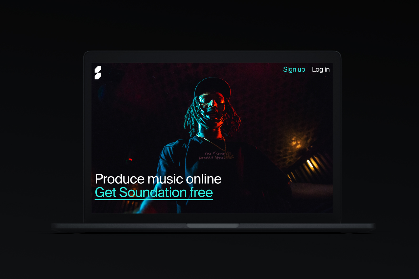
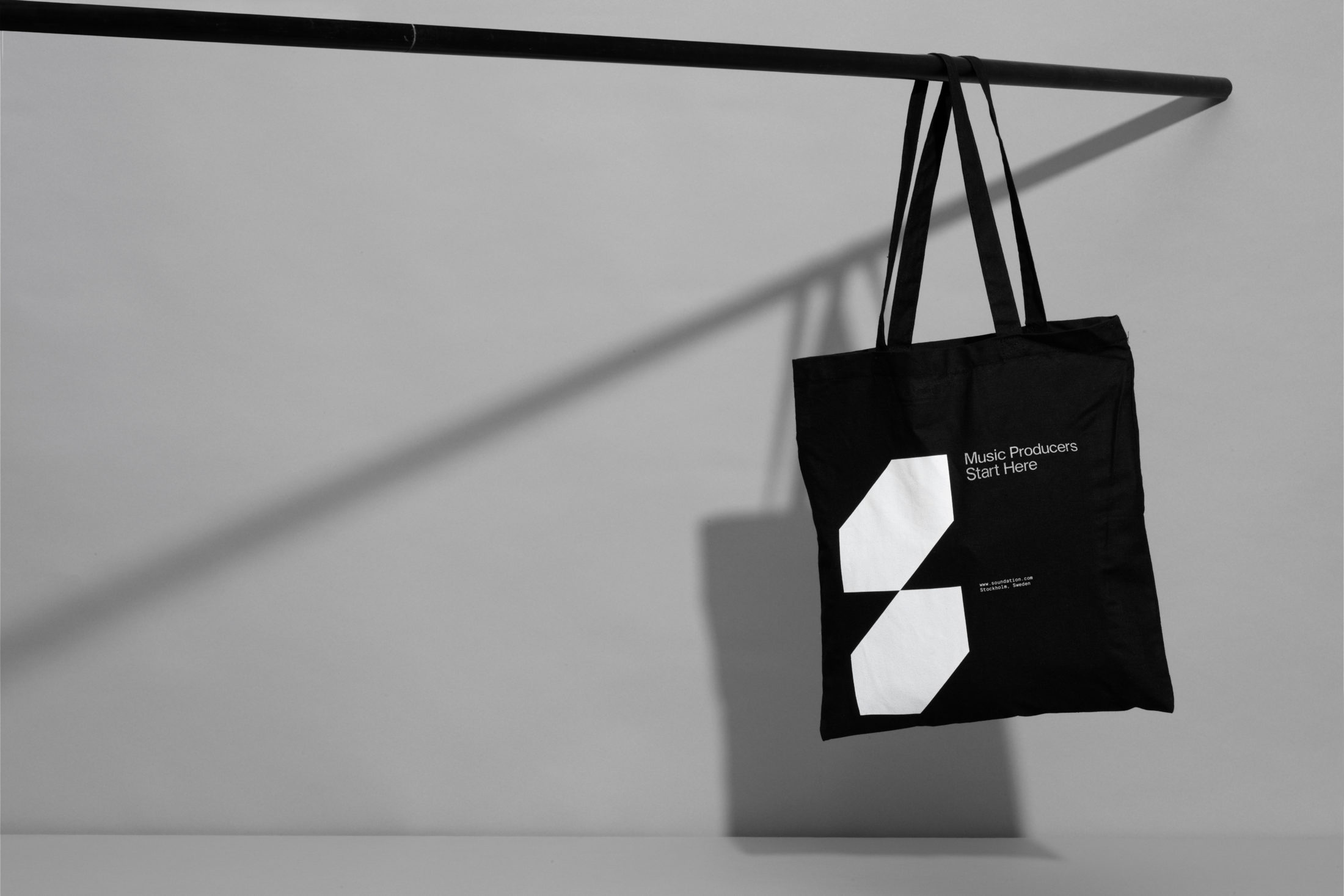
Software on the web? Soundation Studio is an online music production tool that allows musicians,
producers and artists to craft and record tracks from its extensive sound library (Now you can make your fresh remix of that Drake song straight from your browser!). Music can be mixed and sampled directly through the web to be shared with the wider community. Design studio Kurppa Hosk teamed up with Soundation for a brand overhaul, drawing upon their experience in the music and tech sectors working for brands like Pinterest, Superlative and Tink.

Soundation needed a new brand platform that matched it's evolving target audience. As Soundation enhanced the experience of their platform, they started seeing an 'ever-growing demographic of young and ambitious producers' flock to the site. The solely 'in-browser' style software makes it incredibly cheap and accessible, pointing to a greater trend in recent years of the democratization of creative software for the arts; for design, music, social media and more. Everything has a monthly subscription nowadays! And naturally, music production is moving that way too.
Kurppa Hosk started Soundation's rebrand by taking an audit of the current user experience and overhauling elements to streamline cluttered interfaces and prioritize it's most useful tools. Their brief was to enforce Soundation's mission 'to facilitate musical creativity around the world'. The resulting work is a graphic system hosting a depth of cohesion and structure, with a bright and fresh feeling color palette and strong bold choices with typography and iconography (wow that's a mouthful).

The new logo appearing as two stacked rhombus shapes is designed to resemble the letter 'S', for Soundation and has a geometric and almost 3D feel to it. There's a slight optical illusion to the shapes that can be seen as stretched out cubes laying on top of each other. The shapes also lean on a 45-degree angle, a slant that has been used throughout the identity for cohesion and visual rhythm. The silhouette shape of the logo is used throughout as a graphic element or a house for imagery, texture and color. The overall style has a very structural feel to it, as does many of Kurppa Hosk's other logo designs. Their house design style reminds me of the famous logos produced by Chermayeff & Geismar & Haviv (Chase bank logo and Flatiron Health logo similarities anyone?).

I love the color selection for this project, the palette for the brand has a sharp brightness to it, one that really pops off of the black background of the website and software screens. The blue, green and purple form what's known as an analogous color harmony, as they sit next to each other on the color wheel. Analogous color harmonies often create a sense of calm and ease and this is juxtaposed with the traffic cone orange that provides a strong contrast with the deeper royal blue.

Additionally, what's spot on about this project is the presentation, with floating records, business cards photographed in a jumble of music equipment cords and bright poster mocks. The shots of the logo used as a sticker on music gear and instruments create a nice connect between the younger target audience and music production theme of the brand. The website for the actual software is also super slick, with darker backgrounds and intentional pops of color, images and graphics that help sell the product. Making remix's for Drake tracks over the web never looked so good ;)

Hey, enjoyed this article? Sign up to the newsletter for more.