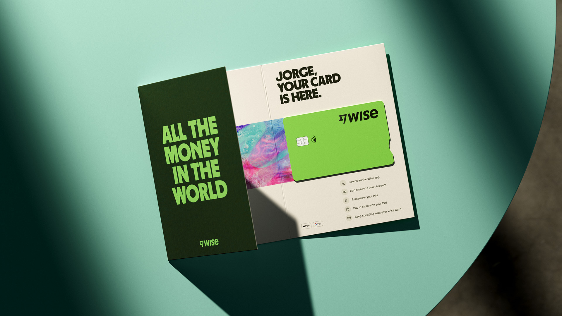
Ragged Edge's rebrand of Wise Interview
Wise move; 3d animations and a more conversational comms style help this fintech brand to stand out in a sea of banky blue
Ragged Edge is a branding agency based in London

MK:          For anyone who’s not acquainted, who is Ragged Edge and what is the studio passionate about?

RE:          Ragged Edge is a branding agency for people who care less about what is, and more about what could be. People with the conviction to challenge the status quo. People who believe branding has the power to change organisations, change industries, change perceptions, and change behaviours. We call them change makers.
We’ve built an agency that champions ideas not egos and a process that rewards brave clients, to create work that doesn’t conform to convention.

MK:          Originally Transferwise, Wise had already been rebranded in 2021, what prompted another look at the brand so soon after the last change?

RE:          The name change was the first step in their rebrand. Transfer wise started with the mission to create money without borders; enabling people to transfer money across the world faster, easier, and cheaper than anyone else. But now they’ve expanded their services beyond money transfers, offering more products and services that help people use their money wherever they go. The name change signaled this shift – from moving money to using money – and while it was a critical strategic decision, changing the name of a publicly listed company takes a lot of work. Therefore, limiting the disruption was always part of the plan. The name changed – and the logotype changed with it – but everything else stayed the same. Once they were ready, they embarked on step 2, bringing us in to take on the full rebranding process and set themselves apart from the traditional, monotonous sea of banky blue.

MK:          What drew the team to the 3D executions and moving textures? 

RE:          Our ambition from the start was to create a new and unique visual language for Wise's illustrations that was also simple and very communicative. Previously, Wise had fully embraced the Corporate Memphis vector people, but they were ready to try something new.

To create Wise's new illustrations, we started by challenging ourselves to develop a new semiotic for 'The World's Money.' This led us to explore textures inspired by the world, weaving together places, people, and experiences into textured tapestries reminiscent of patterns found on banknotes around the world.

Our next step involved our approach to iconography. We had already developed a universally simple icon style that could be understood regardless of language. Combining this approach with our previous work on the tapestries, we created 3D versions of our universal iconography and applied the textured tapestries to their surfaces. This brought a sense of magic and movement to the brand, resulting in the new visual language we were looking for.

MK:          What was the biggest challenge with this project, were there any hiccups or bumps in the road?

RE:          One of the reasons why digital-first brands adopt flat vector illustrations is because they come with small file sizes and can be easily animated using techniques such as Lottie animations or other code-based methods. However, our new illustration style did not follow any of these conventions, and it was crucial to bring them to life in the product. Fortunately, the incredible team at Wise took our 3D files and worked to seamlessly integrate them into the product. They even implemented features that allow the illustrations to respond to the gyroscope and accelerometer in your phone, resulting in movement when you move your device. The main reason this became a huge success, and not a setback, was due to the dedication of the Wise team in creating the best possible experience for the user. It was truly a technical feat to make this work.

MK:          Creating a brand that translates internationally, both visually and tonally can be super tricky. How did the team approach this?

RE:          To ensure clarity and understanding across different languages, using simple language was a top priority for us. We developed a tone of voice that uses the most widely understood words and uses them with confident restraint. This approach does minimise translation issues worldwide, however, this wasn't just a functional decision. Emotionally, it conveyed Wise as being simple, easy to use, and easy to understand. The brevity also creates a sense of speed and urgency. Wise took responsibility for local transcreation with their global team, and always stay true to the original intention of the message and tone, regardless of where it was created. 

Visually, Wise Sans introduces an international feel by reflecting characteristics of scripts from around the world, our tapestries weave in Wise’s customers’ most popular destinations and routes, and the full colour palette adds a vibrancy and earthiness that can be found all over the world. For photography, showing Wise customers with Wise at the centre of their world, was also an important feature. The art direction was intentionally grounded, using natural light or a front facing flash to make you feel connected to the scene with familiar photographic techniques available to everyone everywhere.

On a functional level, the design system needed to support all the 320 languages covered by Wise in the product. Wise Sans supports 342 languages, and Inter supports 119 so we needed to augment the design system with open source alternatives for Chinese, Japanese and Cyrillic. 

MK:          Ragged Edge has a lot of type-driven work, does the studio collaborate with type foundries on these projects? Or are there strong type designers in-house?

RE:          Both! We love creating our own typefaces and collaborating with our favorite foundries. For Wise, we partnered with Mario Feliciano to design the international glyphs for Wise Sans, a customised version of his stunning Parafina display typeface. Additionally, we enlisted the expertise of Luke Prowse at NaN foundry to expand its language support and make some production refinements to ensure its seamless integration into the product. NaN also added 12 new currency symbols to Inter, the open source typeface by Rasmuss Anderson, meaning it works for all of the currencies that Wise supports. Finally, we collaborated with NaN to perfect the Wise logotype, once we had settled on the final design.

MK:          There’s a pretty light and colloquial tone of voice in the copywriting, which is typically unusual for a financial institution, how did you all arrive at that approach? 

RE:          Wise has always intentionally set themselves apart, so we knew that they weren't going to sound like other financial institutions. However, we were particularly inspired by our concept of 'The World's Money' and our ambition to create a brand that is accessible to everyone. Wise prioritizes people in everything they do, which is reflected in their conversational and light tone. Their ultimate goal is to communicate clearly and concisely with just the right amount of personality to stand out.

MK:          I’ve seen Wise’s own team proudly trumpeting this rebrand all over social, how does Ragged Edge go about getting strong buy-in on the client side?

RE:          We already shared some important goals; we knew we wanted to create something unique and we knew we wanted to create the most accessible brand possible so that the product could work for everyone, everywhere. We presented a few concepts and by the second presentation, we all knew we were onto something exciting. From that moment onwards we opened up our Figma files and invited the Wise team in so that they could test our proposals in the product quickly and easily. Bringing brand and product together was crucial to this project’s success, so every element was rigorously tested and put through its paces in the design system. Our single minded concept of making ‘The World’s Money’ work for everyone everywhere drove all of our decisions and kept the whole team pulling in the same direction. This thorough approach and close collaboration ensured that Wise were fully engaged at every stage. We all knew we’d left nothing to chance. It helped create the feeling of one team, all working towards those shared goals. 

MK:          At one point it felt like Crypto could be a form of the new global currency (maybe less so now), do you see this as the case? Or do you see services like Wise as the future of global money? 

I can't comment on the credibility of Crypto, but I can say that I believe Wise is the future of global money. They're creating a better way to make the world's money work for everyone, and their platform already powers a significant portion of international money transfers. At the last count, they were responsible for moving 4% of the world's money and have saved the world $1 billion in fees, which always blows my mind.

MK:          Tiny segway, but on topic with our financial lingo, what advice do you have for designers who are open to slowly compounding their way to success?

RE:          We believe that everything comes down to maintaining a growth mindset. As designers, we understand that there's always room for improvement and a better way of doing things. We stay open to new ideas, different ways of thinking, and learning new skills. We also believe that it's important to work on our craft every day, even if we're only making small improvements. After all, the tiny details add up to the big picture. So it's essential to decide what 'a growth mindset' means to you personally and embrace it. By doing this consistently, you can keep improving and compound your own success over time.

MK:          After surely scanning endless currency textures, which country has the best-designed bank notes? 

RE:          Banknote designs tend to follow established conventions; they feature interesting imagery or culturally significant stories alongside often illegible typography. The (surprising) homogeneity of these designs makes it difficult to choose a favourite. However, during our research, we stumbled upon an old Dowling Duncan project from 2010, which presented a conceptual redesign of the US banknotes. The project focused on improving usability and accessibility. And it reminded us of our own goal: making The World's Money work for everyone, everywhere.

Hey, enjoyed reading this article? Sign up to the newsletter for more