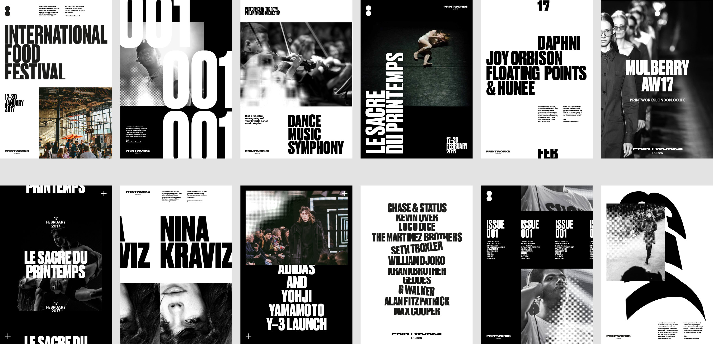
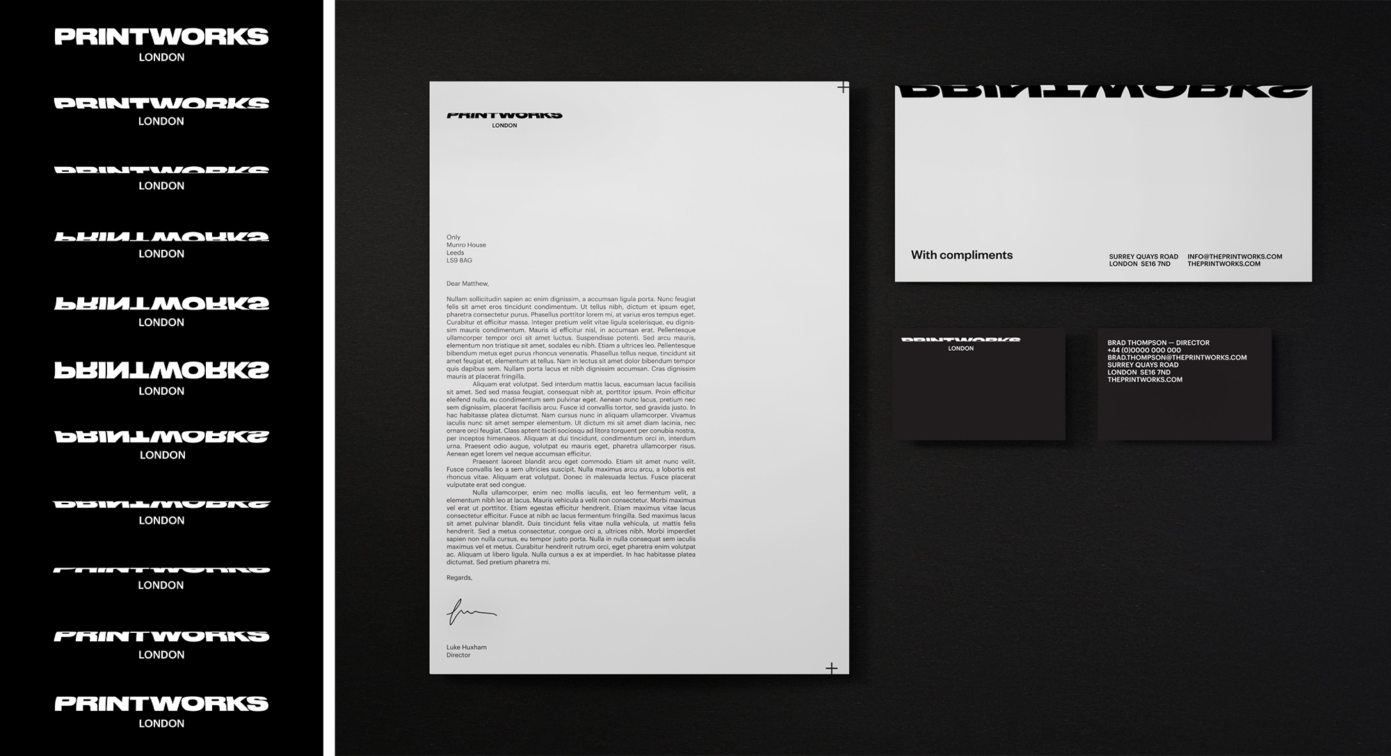
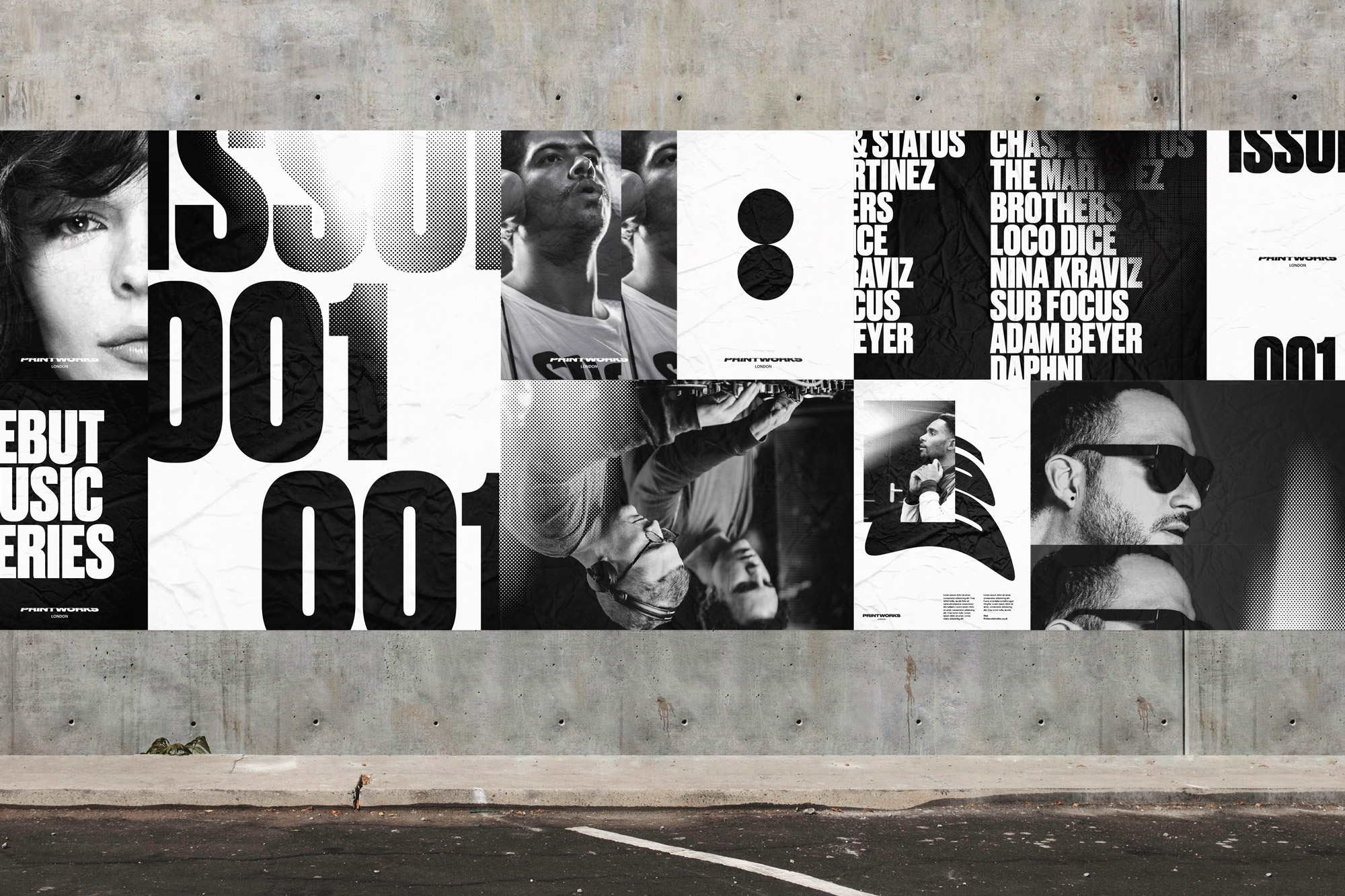
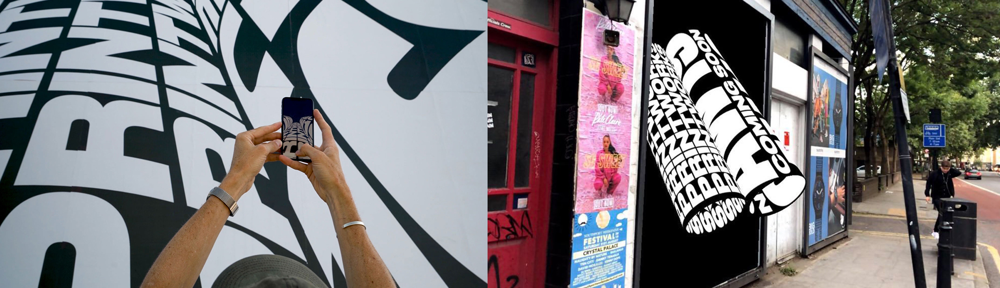
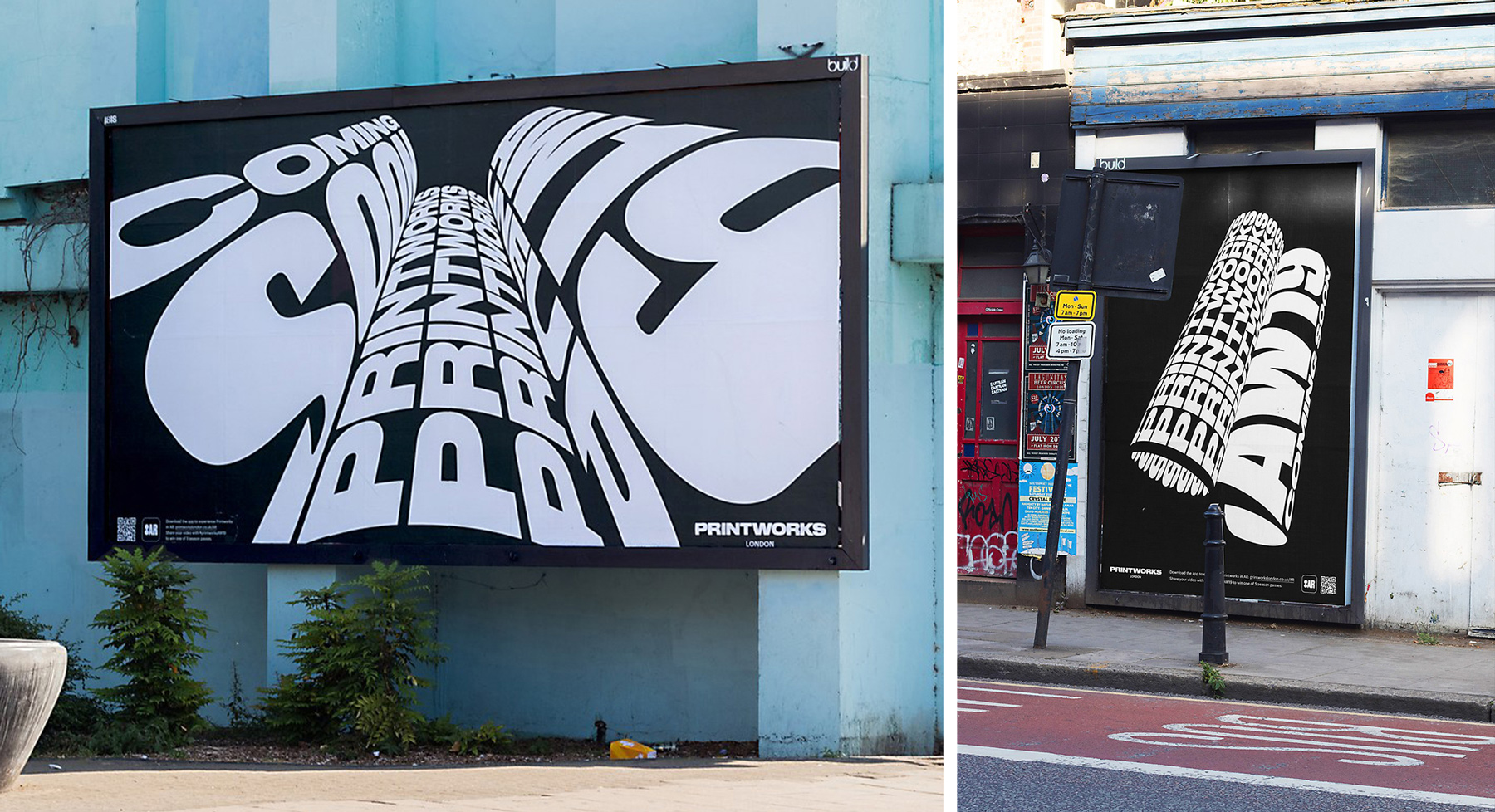
Printworks
Print is dead, but the building isn't.
Printworks London is a warehouse-style event space that's host to an array of dynamic and eclectic events.
Previously the grounds of the biggest printing factory in Europe, it's industrial, spacious interior has been retained with grungy concrete walls and the remnants of the factory space. A hub for the city's cultural events, Printworks’ award-winning seasonal music series has showcased some of the biggest and best live and electronic music events in London since 2017. Only Studio was tasked with creating a brand identity for the venue, with a look that 'revolves' around the concept of a printing press roller. Both a play on the heritage of the site and a graphic vehicle for the typography. The Printworks rebrand ingrains several of these print-related visual cues into the look and feel. In subsequent creative campaigns after the rebrand, Design Consultancy OMSE have lifted this printing roller visual and run with it, creating Augmented Reality executions that bring Printworks to life for their audience by way of experiential and spatial advertising and design.
Figure 1.

To comprehend the clever decisions behind the Printworks branding, it's useful to note that traditional printers use a series of cylinders to print colors onto paper (Figure 1). The cylindrical shape of these printer pieces has been lifted and adeptly utilised for the Printworks wordmark, with the type being warped as if wrapped around one of these cylinders. Multiple iterations of the same logo can be seen, with different revolving angles adding a fun interchangeable variance. This revolving motion is then extended to animations of rolling text, bringing more life to the concept. As seen by the graphic and advertising pieces, the brand isn't tied down to one version of the logo, freely using different versions across various pieces. 20 logos in one? This logo manages to be different every time but is still unmistakably Printworks.

The word, 'Printworks' is displayed in a popular modern display font Druk, it's tall and bold and is at it's best in all caps. This is then juxtaposed with another slimmer sans serif font below for 'London' also displayed in all caps, that helps provide contrast between the two elements. As a companion to this wordmark, a symbol of two stacked dots (Figure 2) is added to the graphic language. Again, Only Studio has combined clever visual and print-related metaphors in these too. The two dots can be seen as two of the printing cylinders stacked on top of each other, and dots? thousands of tiny ones are produced when printing to create an image on paper, producing what's known as a halftone-like effect (Figure 3). The advertising posters for events are additionally 'derived from printed newspaper sheets' and 'historic printing processes'. Only HAS THEN used halftone effects throughout the graphic pieces to further tie these themes together, Dots - Printing - Cylinders - Circles. But do you need to be a print nerd or designer to appreciate this? No. Because it doesn't matter. The resulting graphic executions are seamless, cohesive and punchy, with layouts using scale of typography and clear hierarchy that anyone can appreciate. The decision to limit colors to black and white help to simplify the compositions and bring emphasis away from the imagery and funnel it back to the strong typography.

Printworks and Augmented Reality (AR)
Augmented Reality is the lesser understood sister to Virtual Reality (VR) with one key difference. Virtual Reality looks to create a whole new world, the environment and space around you through a headset. Think the movie 'Ready Player One' or people fumbling around tech conventions with funny visors on. While Augmented Reality uses the ACTUAL world around you but adds a digital layer or interaction through a device (e.g. Pokemon Go). For Printworks AW2019 Creative campaign, Design Consultancy OMSE rolled with the current Printworks printing press concept with a rotating AR twist. Using revolving cylinders as the creative, OMSE has scaled these cylinders up with branded copy and built a custom AR app to interact with the touchpoints, combining traditional printed mediums with technology. When using the app the giant cylinders roll and animate, visualising huge rollers of type through any IOS device. These types of brand interactions help to create exciting experiences for customers and bring an element of play through technology. Encouraging a consumer to download an app to interact with your brand is a tall task, an action that requires commitment. But if you can ensure the customer can have a notable experience it could turn into a big win. In advertising "action changes attitude faster than attitude changes action" - Adam Ferrier. The AR experience OMSE created looks to spur action that encourages a positive, memorable association with Printworks.

As stated above Only's Printworks brand uses a stack of print-related graphics and visual tricks to bring the Printworks brand to life in a way that embraces the building's heritage. The identity helps to frame the space as a bold, lively establishment, the all caps lettering facade reflecting the booming bass inside the venue. The design thinking of the project is made even more valuable by the fact that, whether the audience sees or understands the printing-related visual tricks or not, a contemporary and graphically sound aesthetic is presented, to be enjoyed by all. Often a testament to the sound visual design of a brand is the passing of the torch for another agency to use in a proceeding campaign. OMSE has taken this baton and cohesively applied the look to it's AR experiences, constructing a memorable interaction that spurs customer action. Be sure to keep an eye out for more brands to adopt AR executions in the future, however, they may not be as well put together as Printworks'.

Hey, enjoyed this article? Sign up to the newsletter for more.