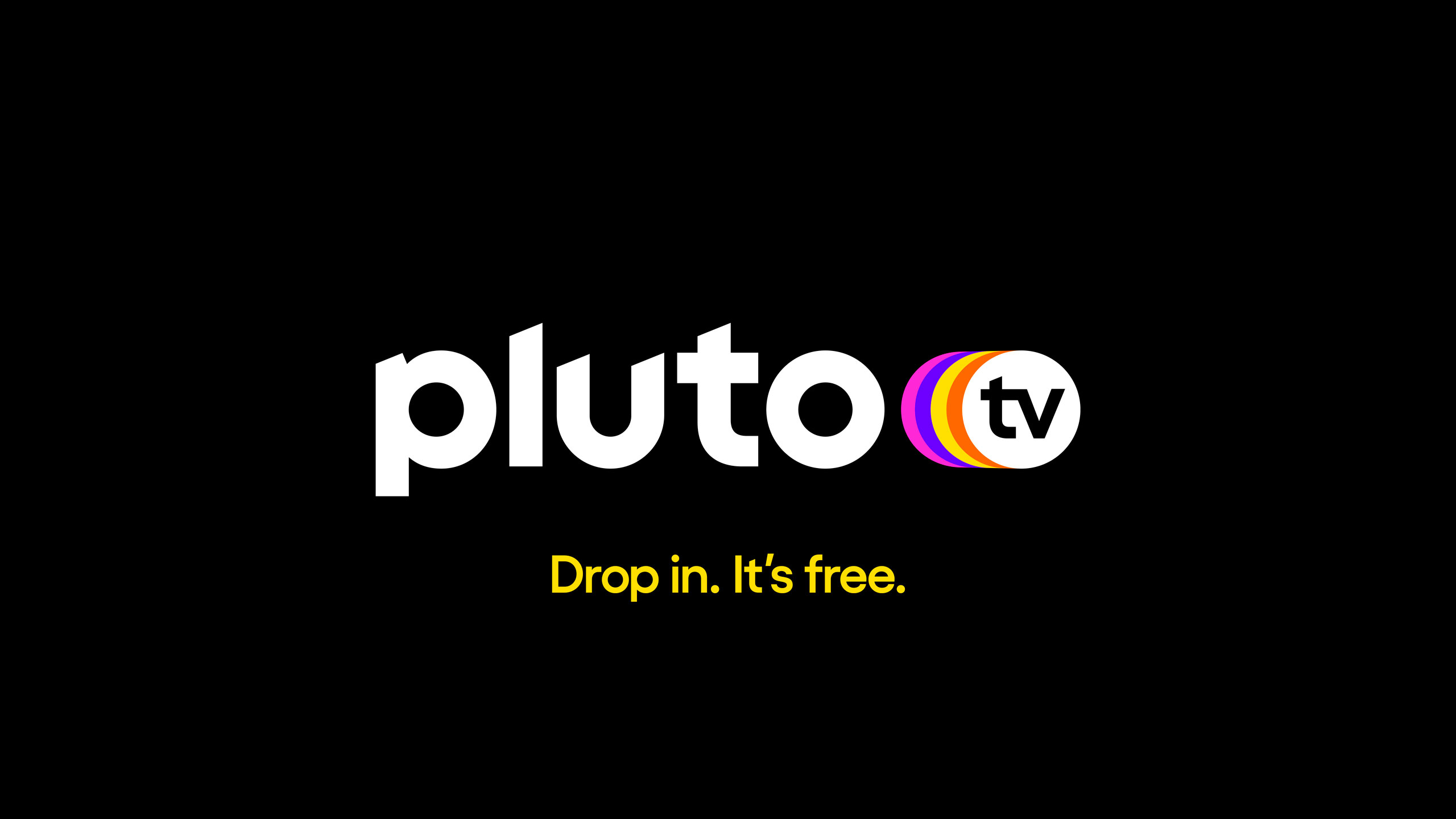
Pluto TV
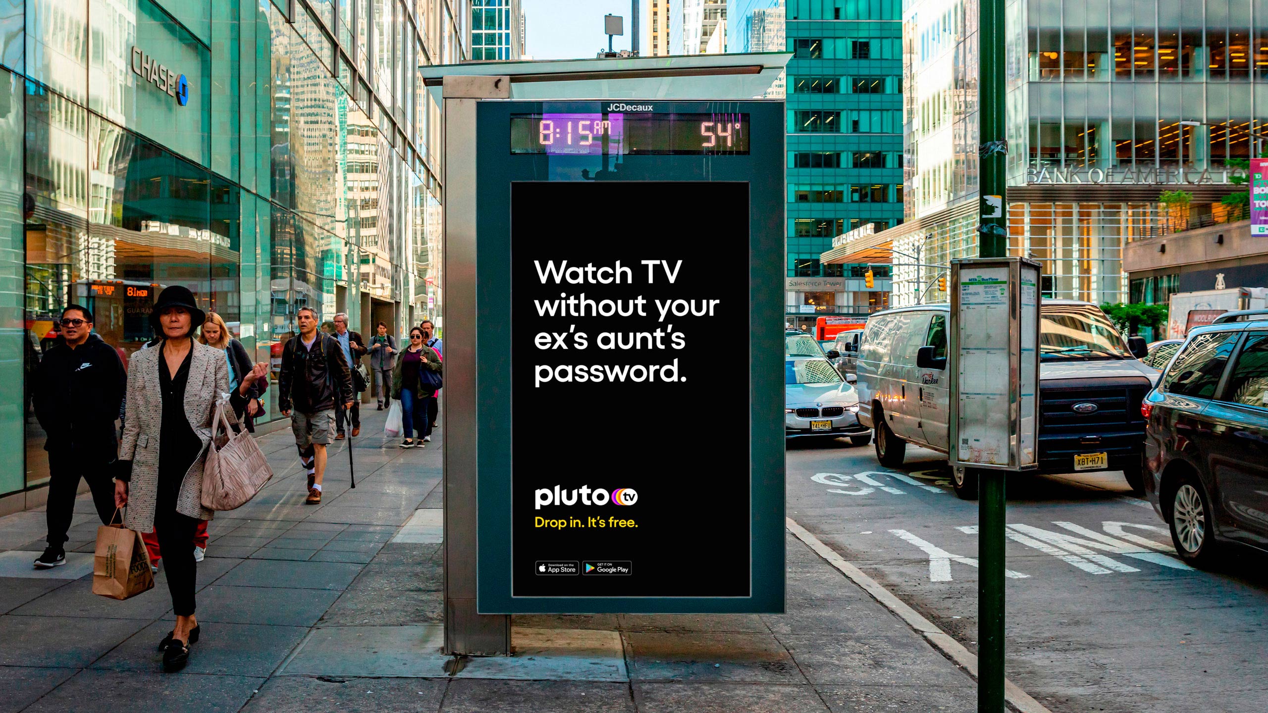
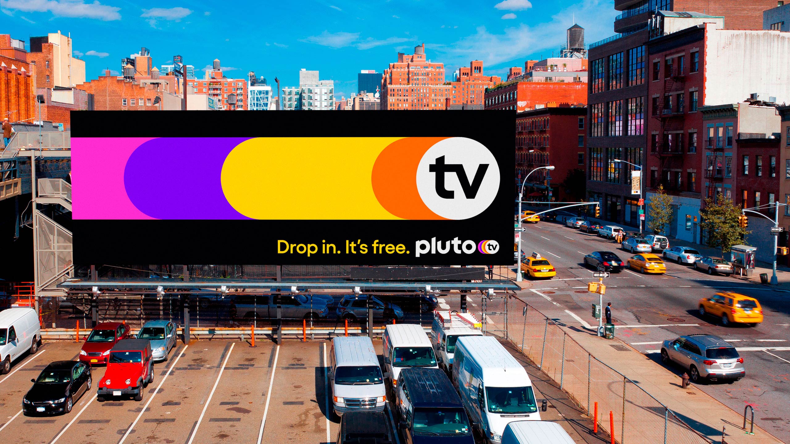
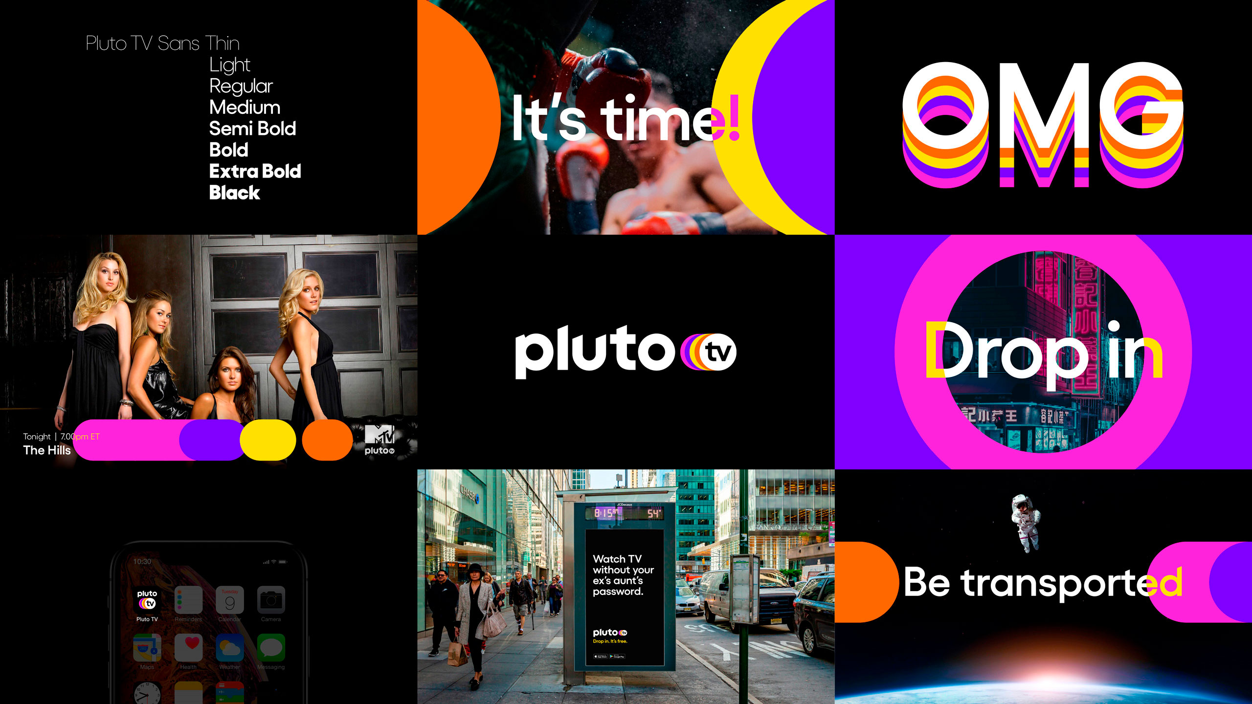
Planets align for Pluto TV's dimensional Design refresh
Pluto TV is a Live-TV streaming service similar to Sling and DirectTV, providing on-demand viewing.
It's essentially like the TV channels of old but with an internet age streaming component. It boasts an over 22 million userbase that's growing exponentially. DixonBaxi recently rebranded the platform, with a set of retro colors and light-speed-style visuals.
DixonBaxi are no stranger to TV - Streaming Services? Platforms? Channels? whatever you call them these days, with the likes of AT&T, Viacom, Channel 4 and Netflix listed as past clients. The new brand isn't a complete shake-up (see Figure 1 - old and new logo). But it offers a sharp, updated sophistication that helps it to stand out among the hordes of media services who now have a stake in the battle of streaming wars. I mean seriously, can anyone name all the services that are out there now? There's hundreds...

Figure 1

The colors and motion design are what originally caught my eye for this rebrand, the 4 colored circles are utilized as transitions for frames and all connect to the central 'portal' (the circle around 'tv'). Some of the animations zip into a slingshot visual through the portal with a Lightspeed reminiscent blur of dots and lines to then advertise the platform's content. This creates a clever connect between Pluto's 'portal' and the space-related name itself. It's a delightful trail of color that transports you into the Pluto TV universe. The 4 central colors really pop off the black spacey background, creating a strong contrast and eye-catching vibrance. The copy invites users to 'Drop in. It's free.' I think the 'free' can grab people's attention, no subscription fee here, just like the TV of old. Other copy lines in the creative take playful jabs at subscription-based streaming services with lines like 'Watch TV without your ex's aunts password'. This also highlights the in-between space that Pluto finds itself in, essentially a traditional tv service but crafted and executed for the internet streaming age. In DixonBaxi's own words it's 'a shared, leaned-back linear television experience but with the control of a streaming service'.


Typography, A key expressive piece for the rebrand; is a custom typeface developed in collaboration with Martin Vácha from Displaay Type Foundry (check-out another great font by Displaay 'Roobert MF'). The typeface coined 'Pluto TV Sans' has eight weights and some distinct features, like sliced off ends of L's T's & D's that add motion and sharper angles. This is then contrasted with exceedingly full, rounder shapes throughout that give off a more approachable feel. The type is expanded in some instances with repetitions of the same word seen as an echo after one another (Figure 2). Additionally, when combined with the portal, colors are switched and maneuvered adding another level of visual interest.

Whilst following some similar tropes with streaming service identities, i.e. a pop of color on a black BG. Think red on black for Netflix, green for Hulu. Pluto TV does, however, set itself apart with a refreshingly vibrant quad color combo and it's interdimensional design device, the portal. Especially memorable is the logotype, with Displaay's custom typography the new logo has much more character than the original and should do well to serve Pluto TV as it continues to grow its platform and viewership.

Hey, enjoyed this article? Sign up to the newsletter for more.