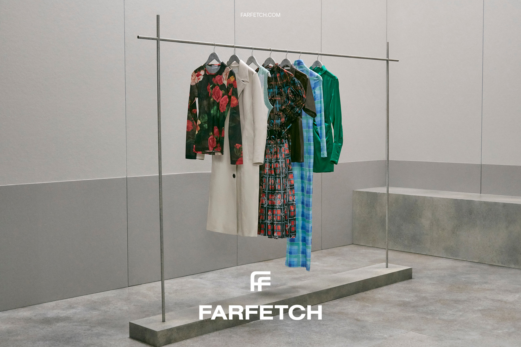
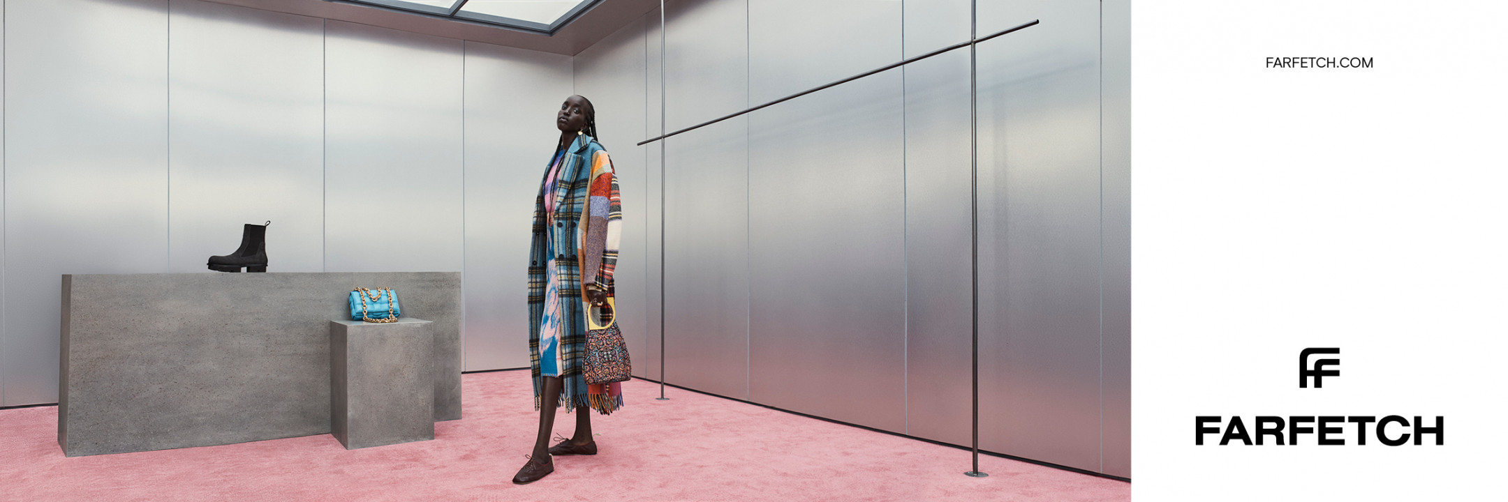
Farfetch
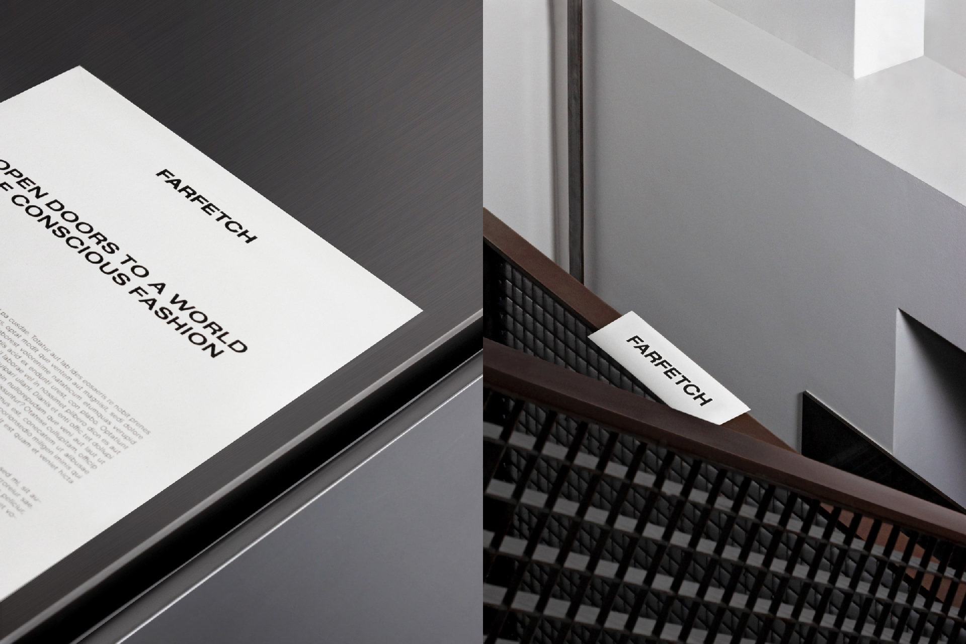
It takes confidence to be reductive
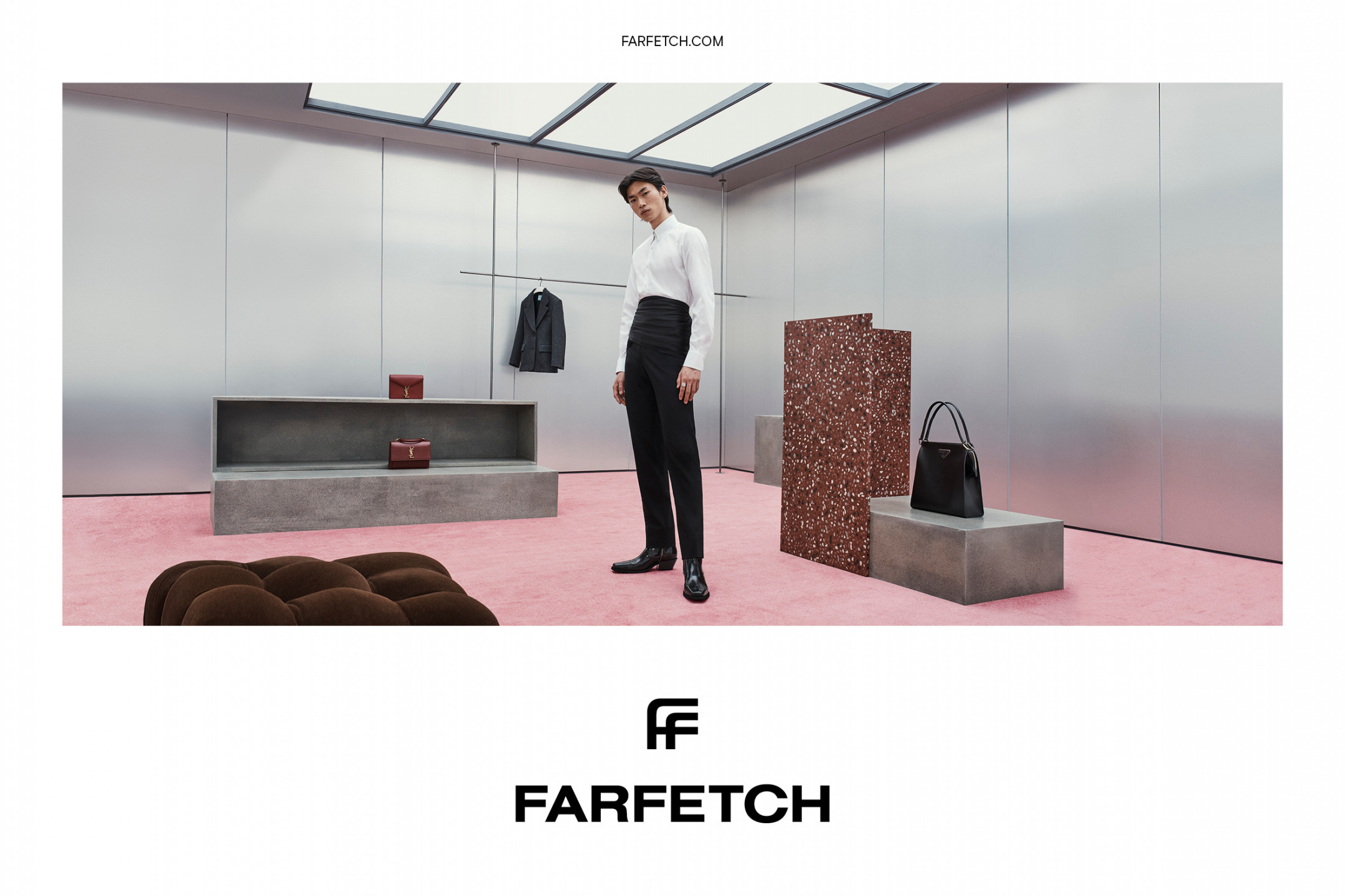
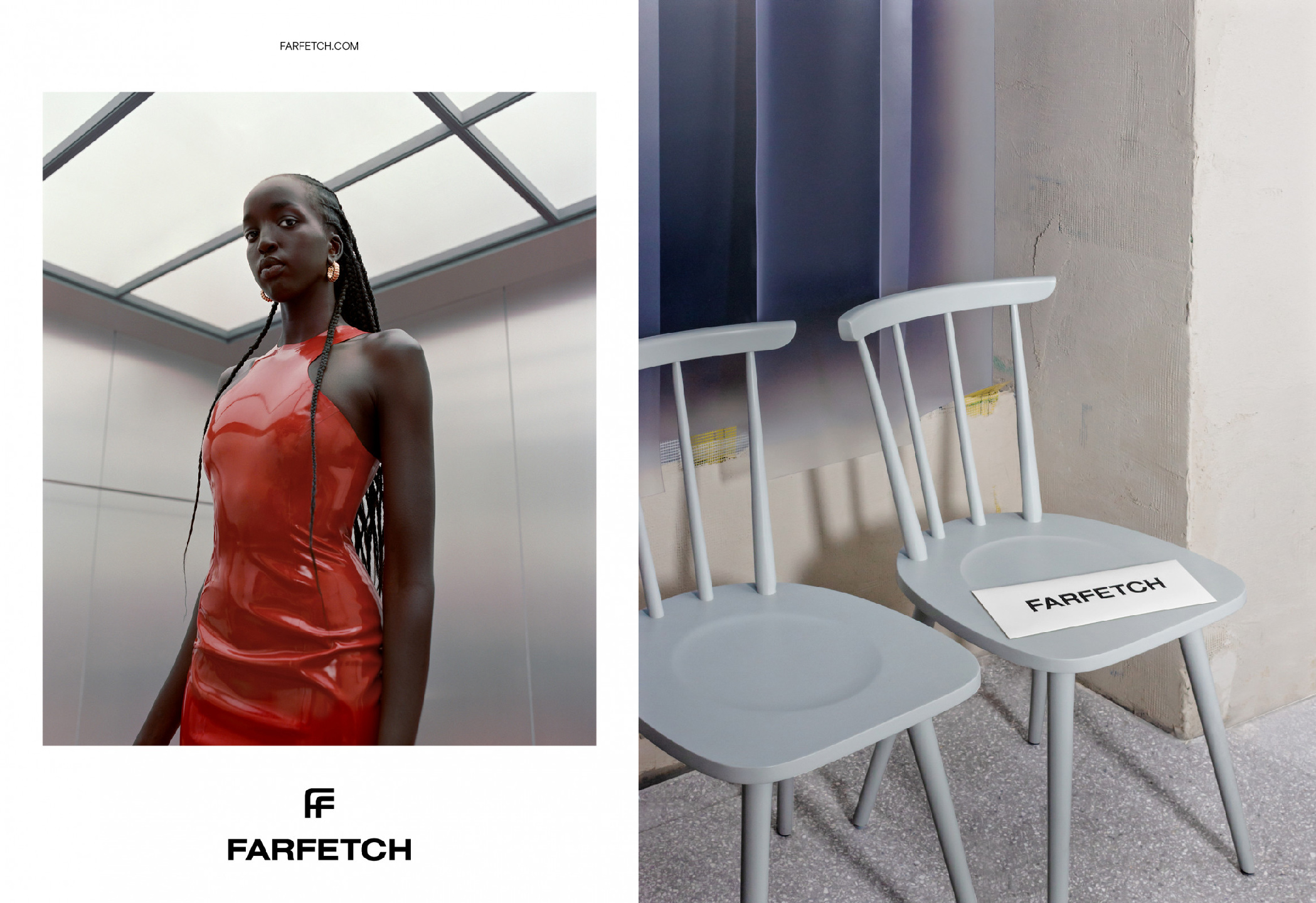
"It takes confidence to be reductive." Farfetch is an online luxury fashion boutique with a portfolio of over 1,200 divergent brands from established and emergent designers alike.