Code, Pen and Paper. One in the same for Lundgren+Lindqvist
Lundgren + Lindqvist (L+L) is a design studio based in Sweden. Sweden? Again with Scandanavia I hear you ask? Yes again, their shit is the best, it's like Europeans were BORN knowing how to design.
Anyway, I digress, L+L has an interesting approach to design with a philosophy that prioritizes code as essential and natural to the design process as pen and paper. Given the ubiquitous nature of the internet and websites in the 21st century, this outlook makes complete sense. Nowadays, not only does every business or brand need a website, but web design and development is often the most profitable of all digital design avenues. Code indeed should be a priority.
Figure 1
Figure 2
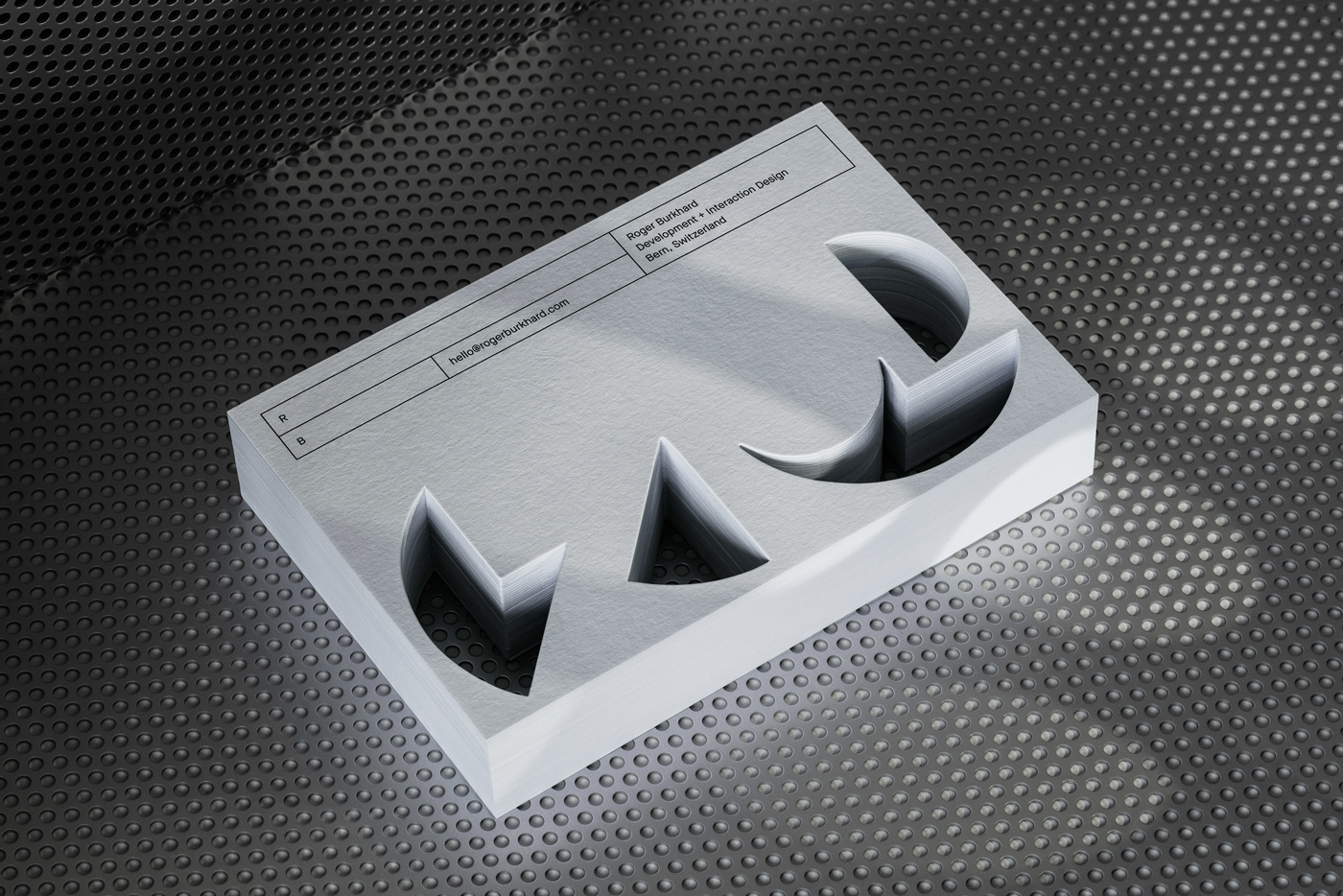
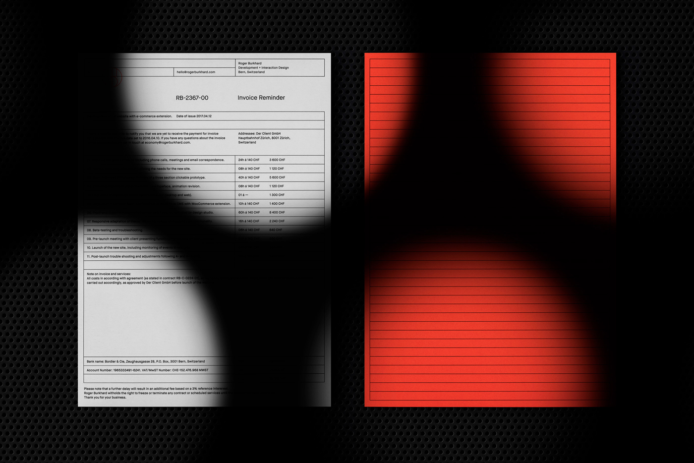
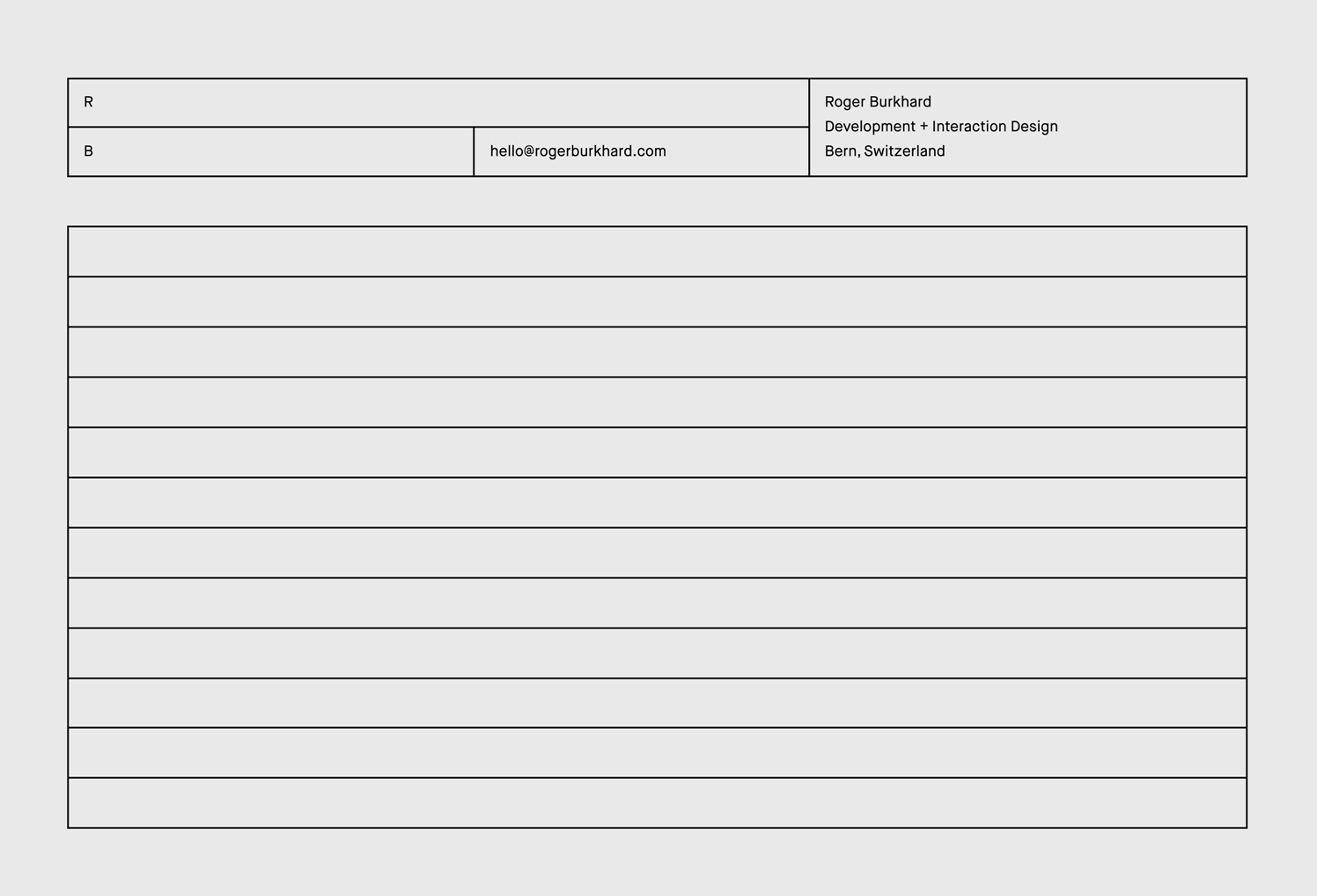
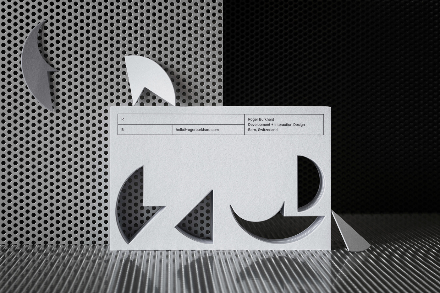
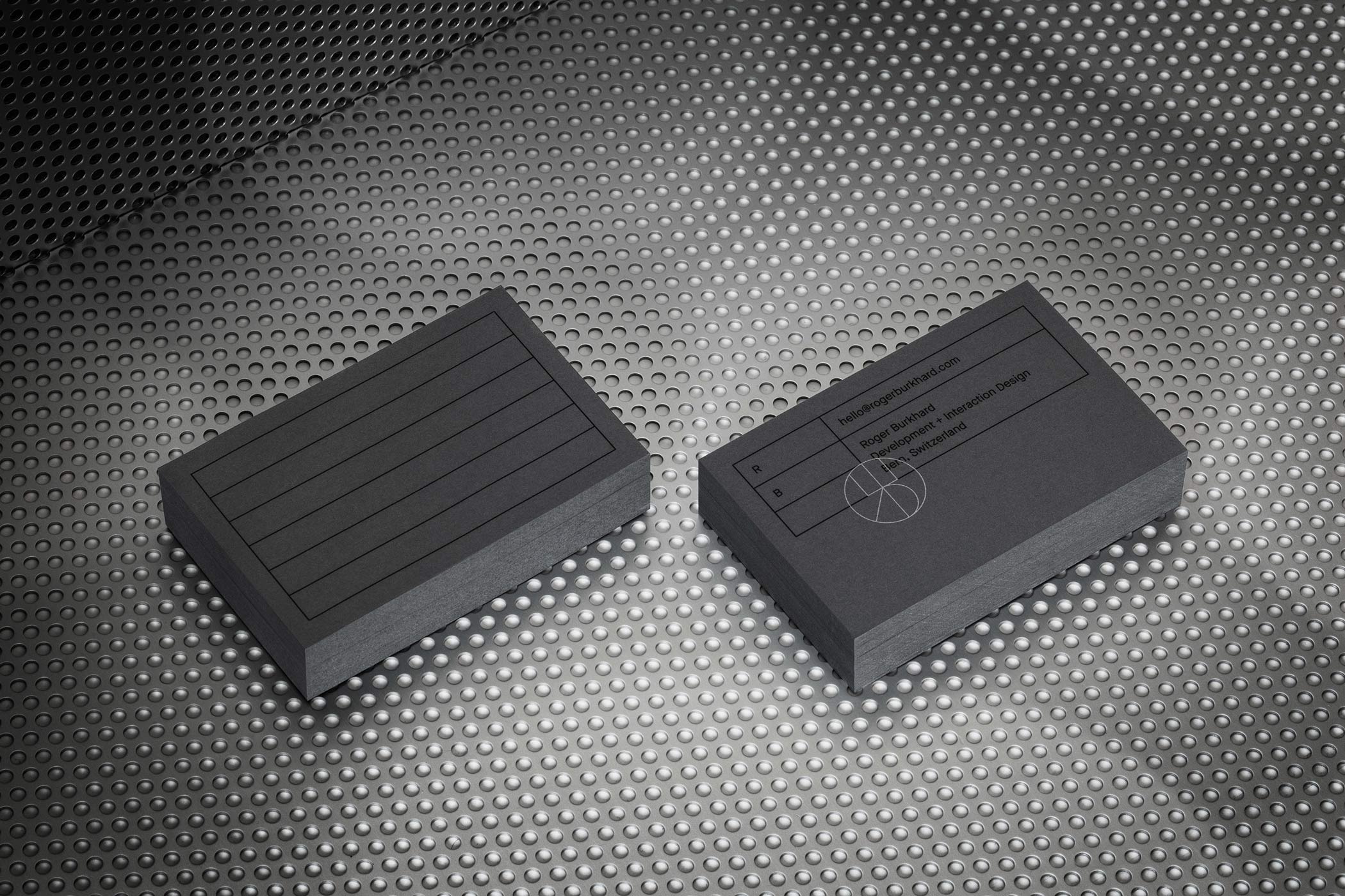
Back to the design of this project, L+L's constructed the lustrous identity for web development practice Roger Burkhard. L+L created a precise and structured design system alluding to the pinpoint perfect and efficient website builds that Roger Burkhard constructs. Taking a look at the marquee header (Figure 1.) we can see that it acts as a visual anchor on printed pieces and the website. The modular boxes interchangeably move horizontally to accommodate different copy blocks and pieces of information, creating a flexible and dynamic network.
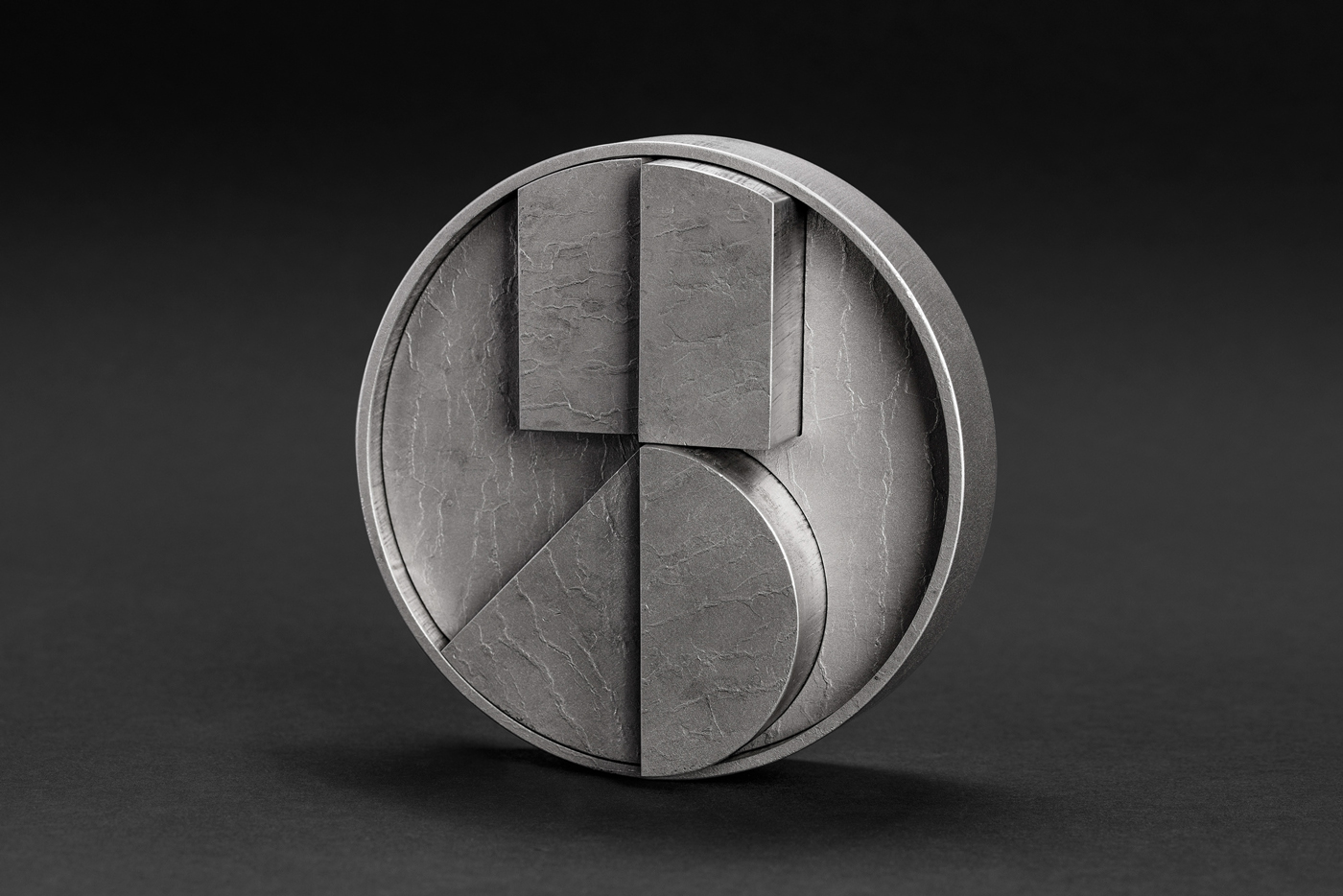
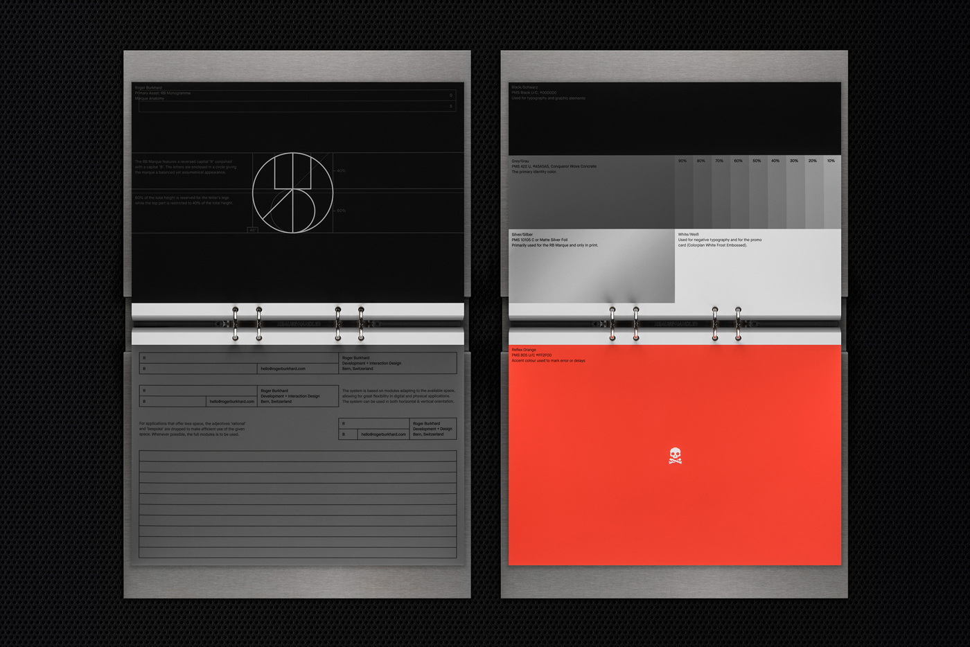
The graphic system revolves around this modular and flexible grid marquee as well as a monogram of "RB". The monogram is geometric and sharp and also appears in 3D (figure 2.) with interlocking pieces and abstract shapes. These same pieces are then used as die cuts on the business cards, taking familiar shapes in the monogram and utilizing them in new and dynamic ways, whilst remaining cohesive with the brand overall. The palette uses a slate of different greys combined with a punchy volcanic red/orange accent. As a consequence, a slick and dark feel is produced, but not so much that it feels overbearing or brooding. Additionally, the paper used is custom crafted from Italian manufacturer Favini. Talk about lux.
With a focus on code, pen and paper, it's interesting that what actually stands out to me about L+L's work, including this project, is their sophisticated level of polish and excellent photography. They have a self-proclaimed focus on making their work bespoke, bringing a customized and flexible philosophy that results in incredibly unique work. Their project shots have incredible clarity and it's clear they really go the extra mile. One particular project even appears to feature photographs of live chameleons and a live parrot in another? I mean where do you even get chameleons? Does anyone know? It's like an episode of Tiger King with this studio... Regardless, L+L's projects are certainly memorable, with no cliches, common tropes or fads that appear anywhere. With this sleek and sophisticated Roger Burkhard identity serving as no exception.