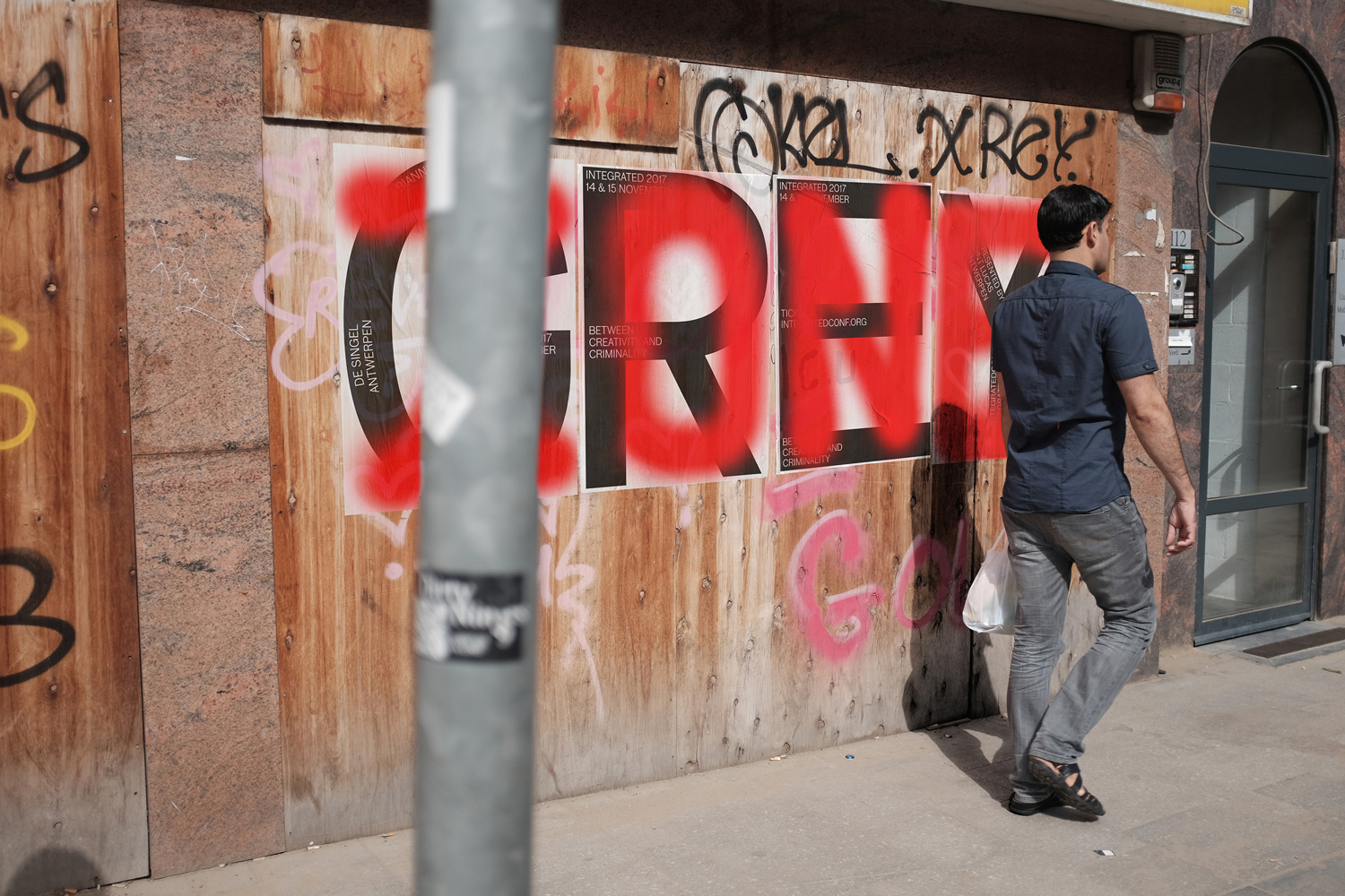
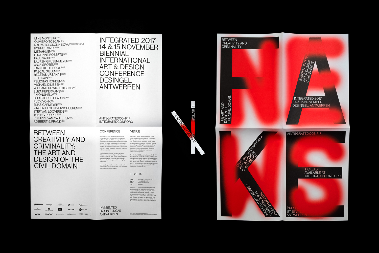
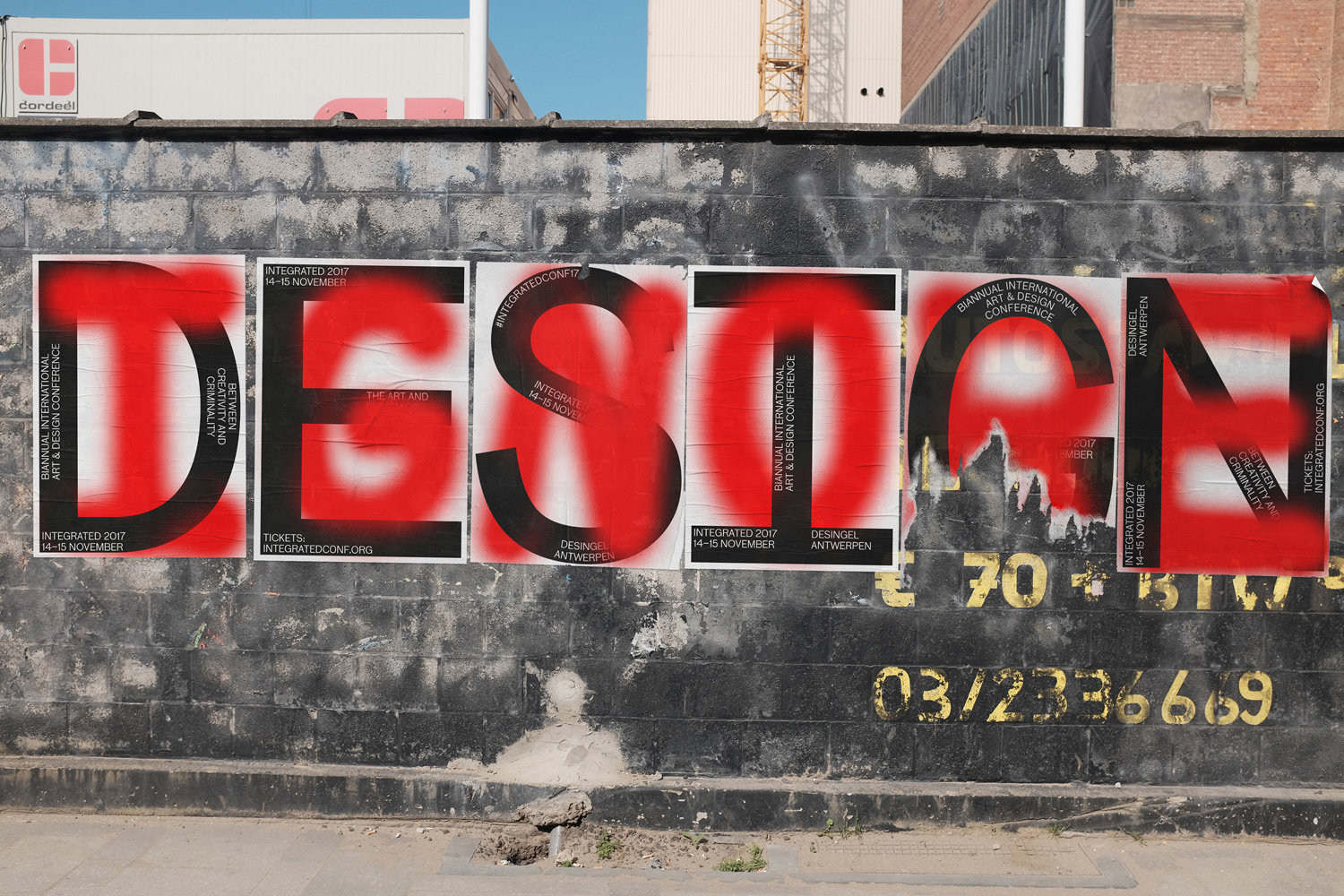
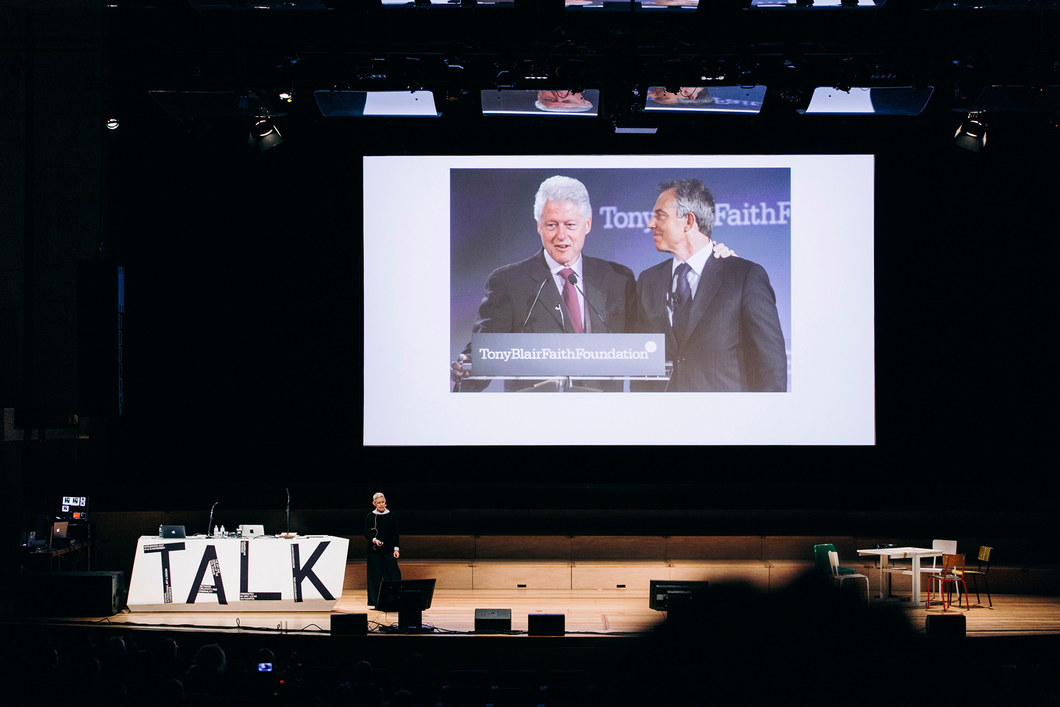
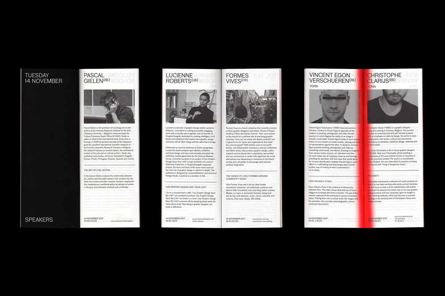
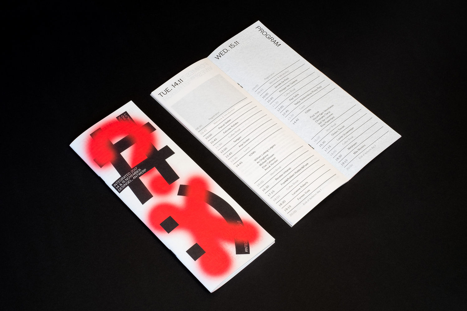
Integrated Conference
Fake news and a fake campaign
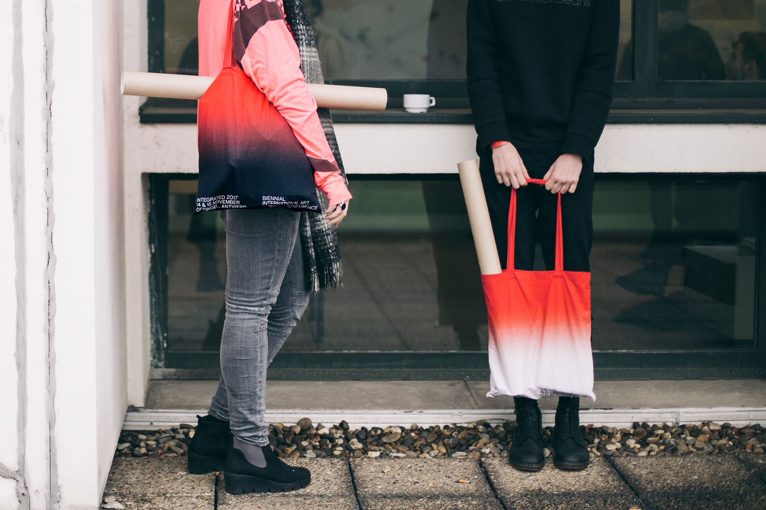
"Integrated" is a Biennial Art and Design conference based in Antwerp that hosts students, industry professionals, enthusiasts and the like to encourage a dialogue of design thinking, methodologies and creative inspiration.
The conference labelled "Between Creativity and Criminality" explored the current state of civil discourse, the grey areas between markets and the state, between corporations and the law. Like crowdfunding campaigns that illegally fund the fixture of potholes in San Francisco, Environmentalists that tie themselves to trees, ethical hackers or fake news sites that look to stoke public divisions. Ambiguous actions led by civilians (often breaking laws) that are castigated by the state and shunned by corporations but look to create seismic shifts or change in society.

Creative agency Mirror Mirror created the visual communications for the event with a strong typographic facade. With projects for titans like Uniqlo and Coca-Cola under their belt, their work for Integrated has a free and unrestrained feel that is supported by street paste-ups and guerilla-style public posters. When presented with the brief, Mirror Mirror was posed with a question, does the grey area "between creativity and criminality, still offer an inviting canvas for communication?" and do these movements, actions and changes primarily happen in the 'real-world' or have they transitioned to the digital realm? To kick-start this question they posed a trick, photoshopping their graphic posters in-situ on walls and public places to give the illusion they were there in "real-life". That's right, all the pictures of the posters in public in this post are fake. This digital launch of the conference was then followed by collateral like brochures, merchandise, booklets as well a stage design and video.

The clash between creativity and criminality is embodied by the two juxtaposed letters in Mirror Mirror's collateral. Starkly opposed, the black letters are one of sharp angles and structure whilst the vibrant red is graffiti-like and rebellious, arms and legs of the type are intertwined creating a dynamic interplay between the two opposites. The posters in unison spell out conflicting statements "VOTE" is weaved with "HACK", "DESIGN" spliced with "IGNORE", "FAKE" flows strategically beneath "NEWS" and so on, highlighting opposing forces relating to the theme of the conference. Additional information on the conference like dates, hashtags and web links fit within the larger black letters ensuring the posters communicate all of the relevant details as well as capture the viewer's eye. The red sprays continue their appearance throughout the collateral pieces with a red to black gradient apparent on the tote bags and red misty lines in the gutter of the speaker brochures. This doesn't just end on the print pieces, the website adds an enjoyably quirky feature that sprays out red wherever the mouse travels across the page. Hover effects are then used again when perusing through the list of speakers, with image pop-ups of portraits and the speaker's works. The websites linear style is effective and the all caps titles on the left provide useful navigation up and down the site.

The chosen font throughout the website and conference pieces works well in all caps, it is repeated throughout the campaign but never feels as if it's shouting or hindering legibility. The typeface known as Bau is sharp and contemporary and was designed by Christian Schwartz a veteran typographer and partner at Commercial Type. Mirror Mirror has masterfully used one weight from top to bottom in the designs, achieving hierarchy and visual interest throughout.

Whilst the obscurity and complexity of the event topic can be hard to grasp, Mirror Mirror has appeared to latch onto the overall idea of opposing forces. Creativity vs criminality, this idea is packaged up neatly with the interweaving of typography on their posters, the black representing order and the graffiti-like red embodying criminality. Capturing a blend of street vs strict through its juxtaposition of different lettering styles. Combine this with the clever two-word pairs that the posters spells out and the campaign has a conceptual completeness to it that earned it a wood pencil from DA&D. In tandem with their faux digital poster releases, Mirror Mirror have embodied the conference’s clash of ideas with punchy paradoxes setting the stage for deep dialogue during the conference itself.

Hey, enjoyed this article? Sign up to the newsletter for more.